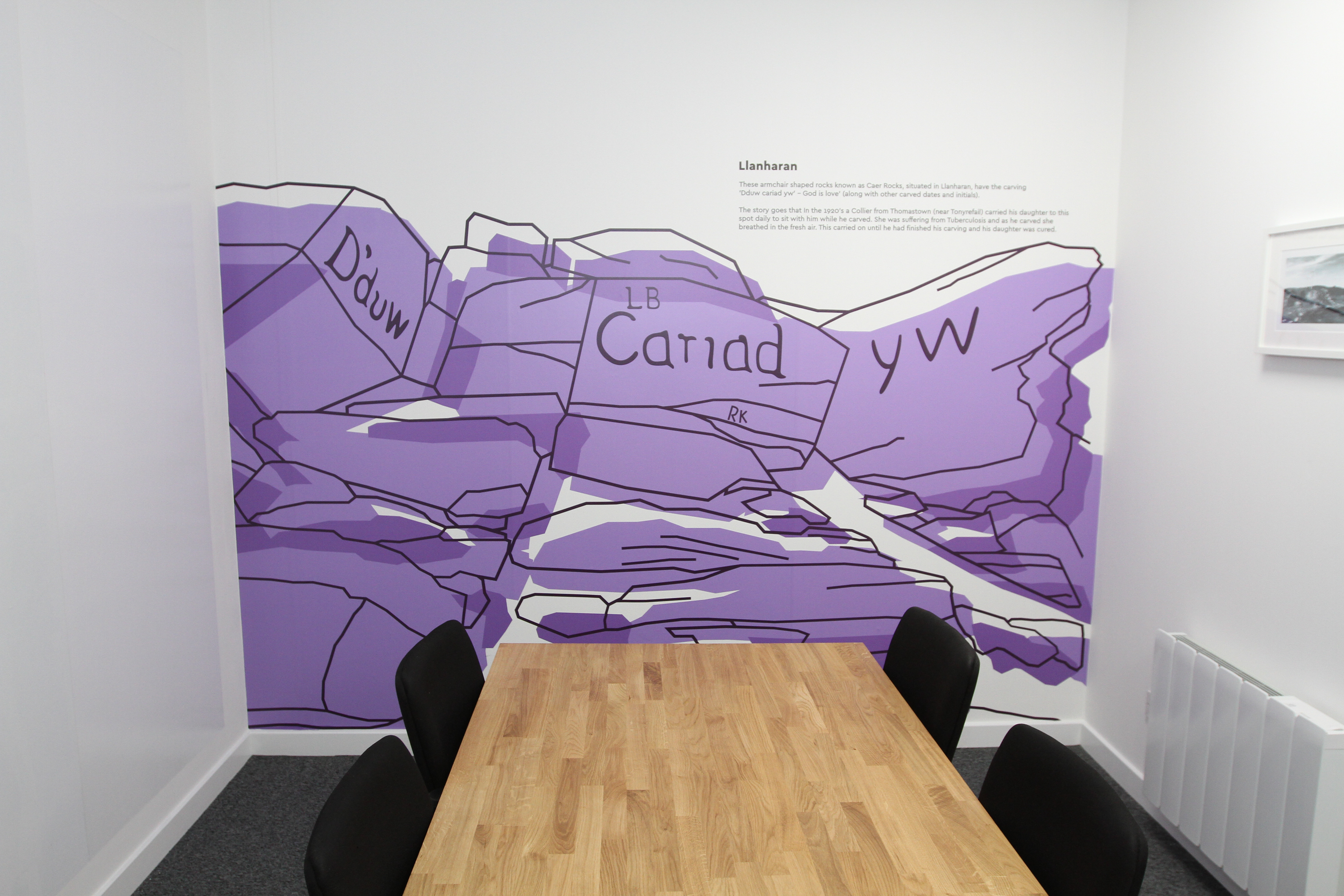
During my time with the Trivallis Media Department, I was tasked with designing wall decals and door signs for multiple meeting rooms as part of the re-design of their main offices.
As part of the interior re-design, each floor of the building was allocated a colour. To meet RNIB Standards (Royal National Institute for the Blind), each floor incorporated at least three colours: a main floor colour, the Trivallis brand grey and pure white. These were used to create strong contrasts, helping visually impaired staff and visitors better perceive the shape and depth of each space.
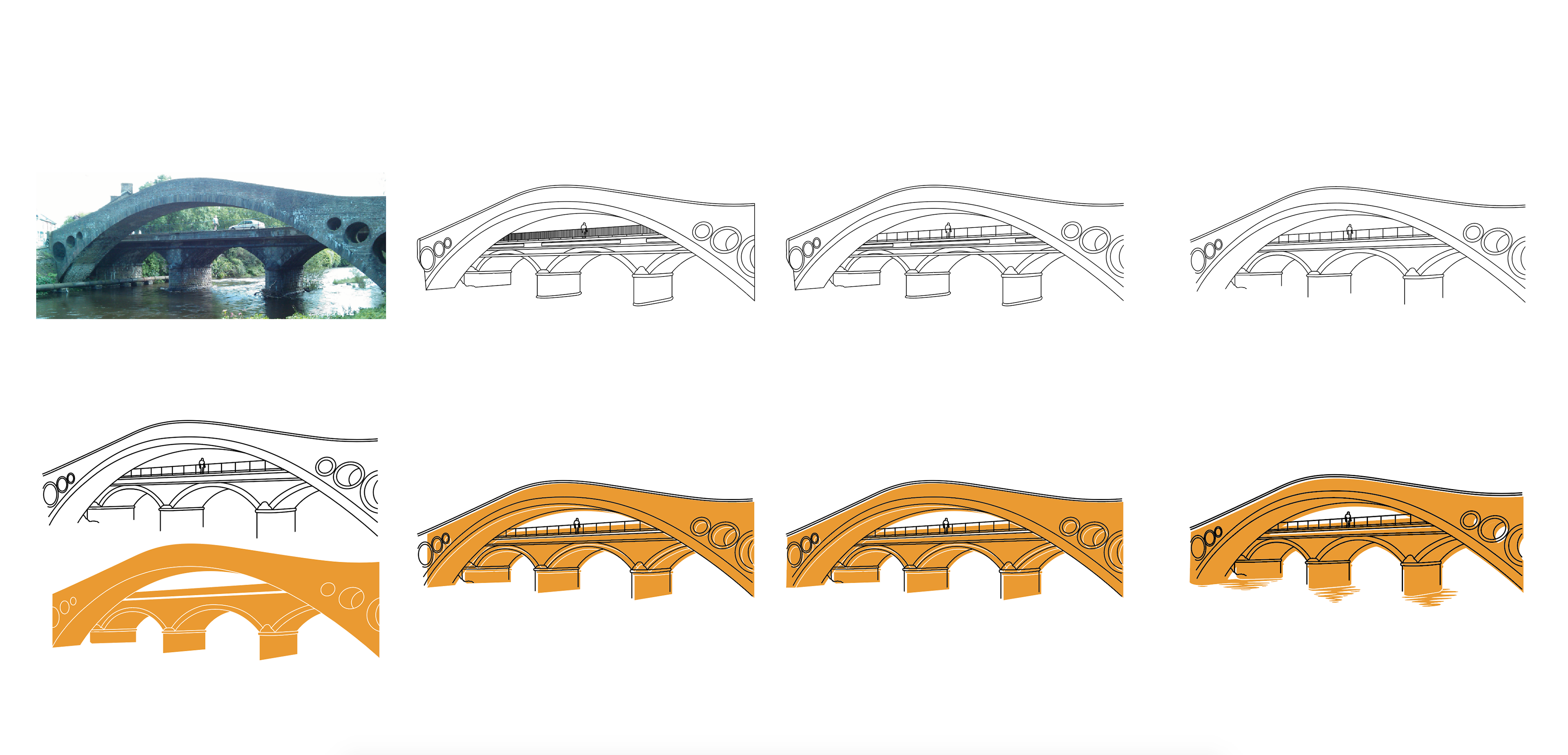
As a housing association operating in the Rhondda Cynon Taff area, each room was themed around a recognisable local landmark, using clean and simplified design stype. Where landmarks had unclear or irregular edges, designs were adapted to fit the wall space and allow for cropping and scaling. Each wall decal was also accompanied by a short description.
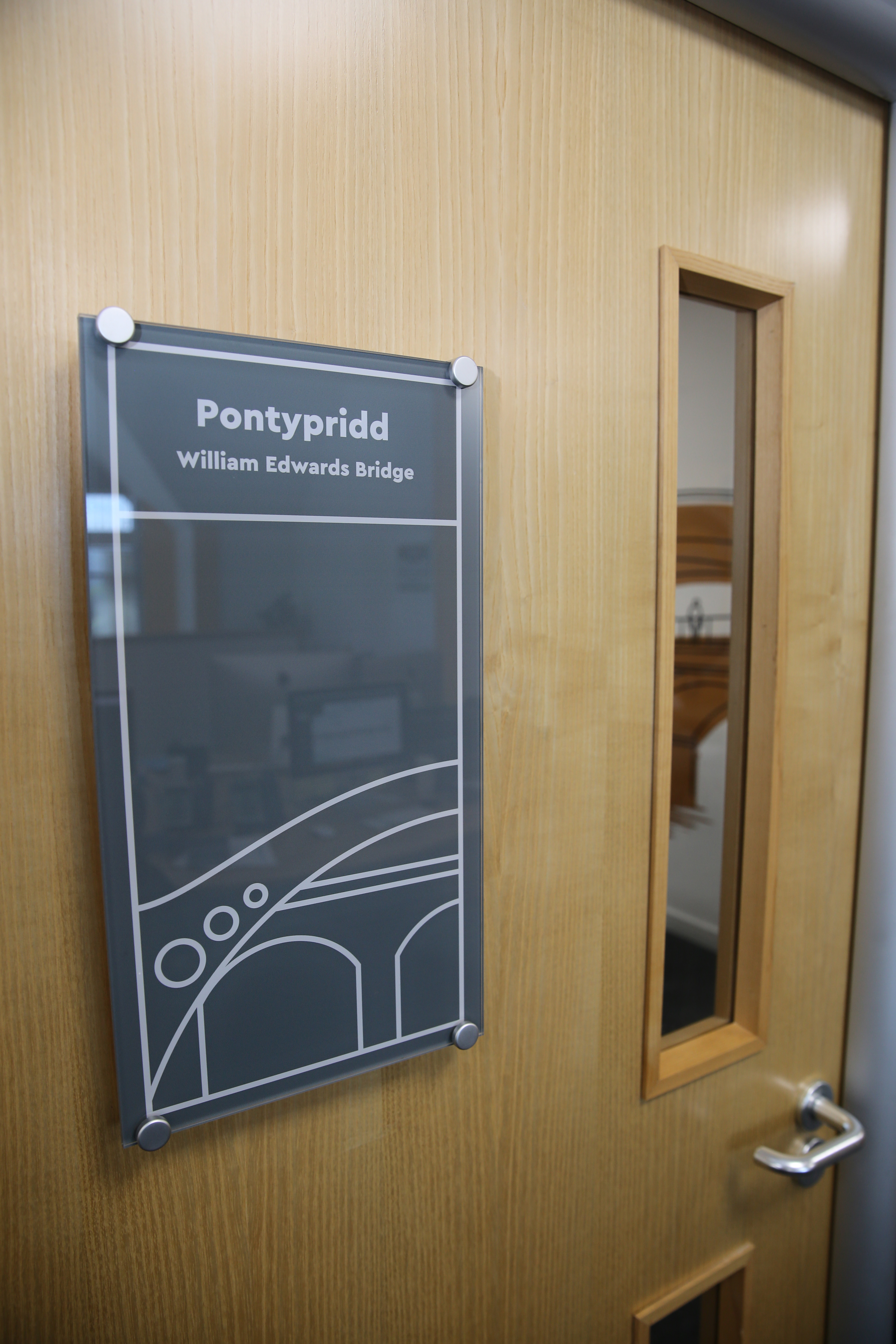
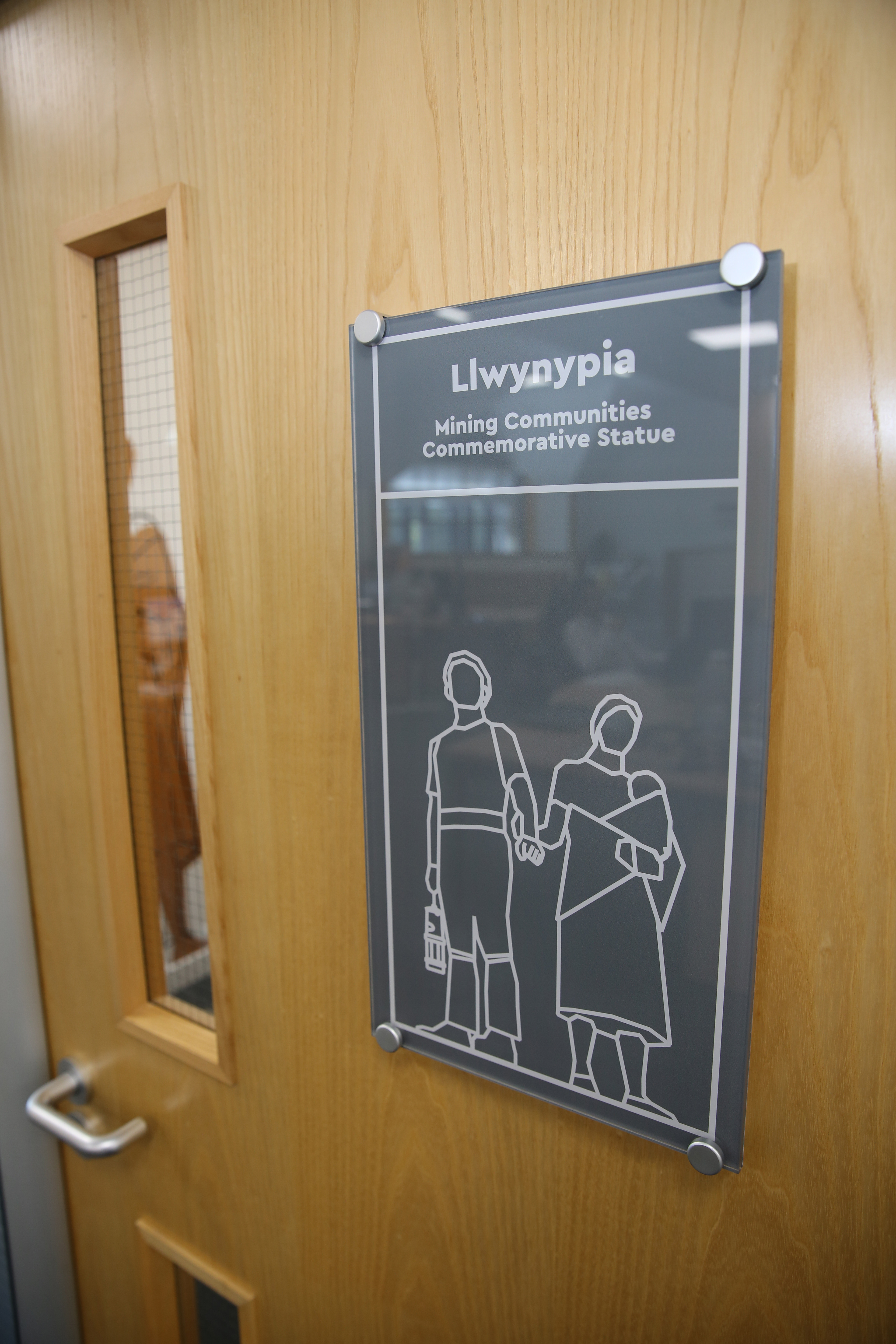
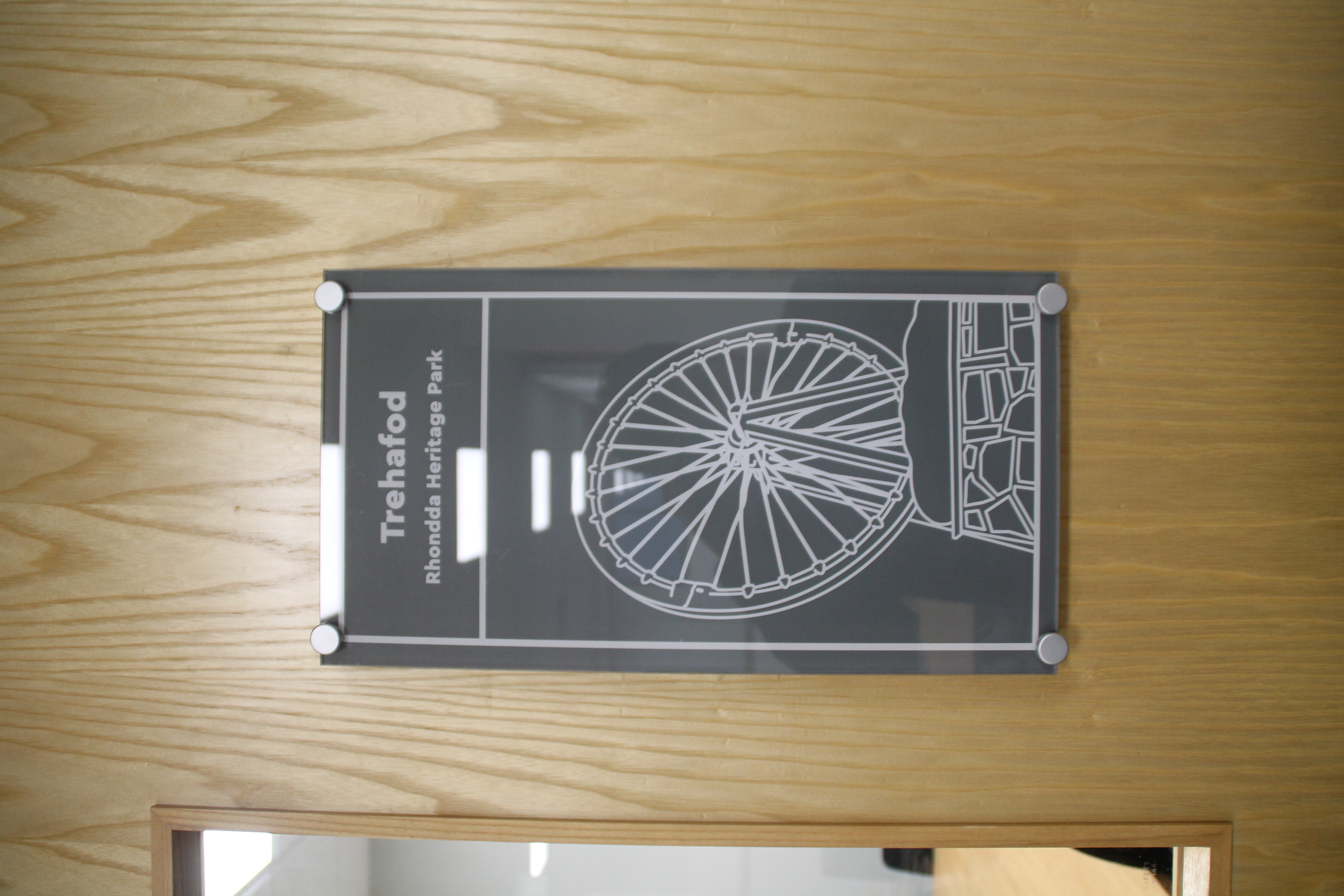
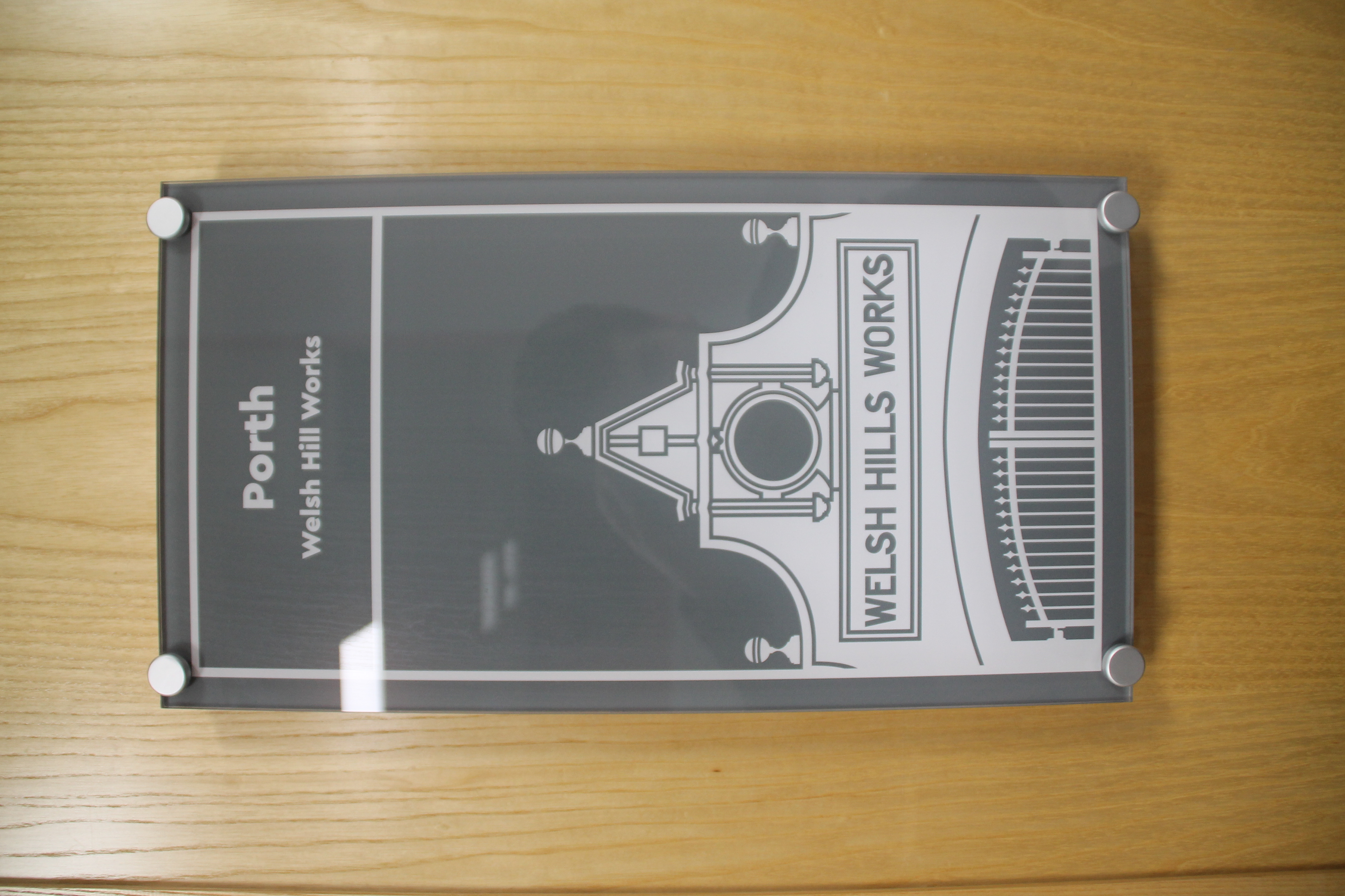
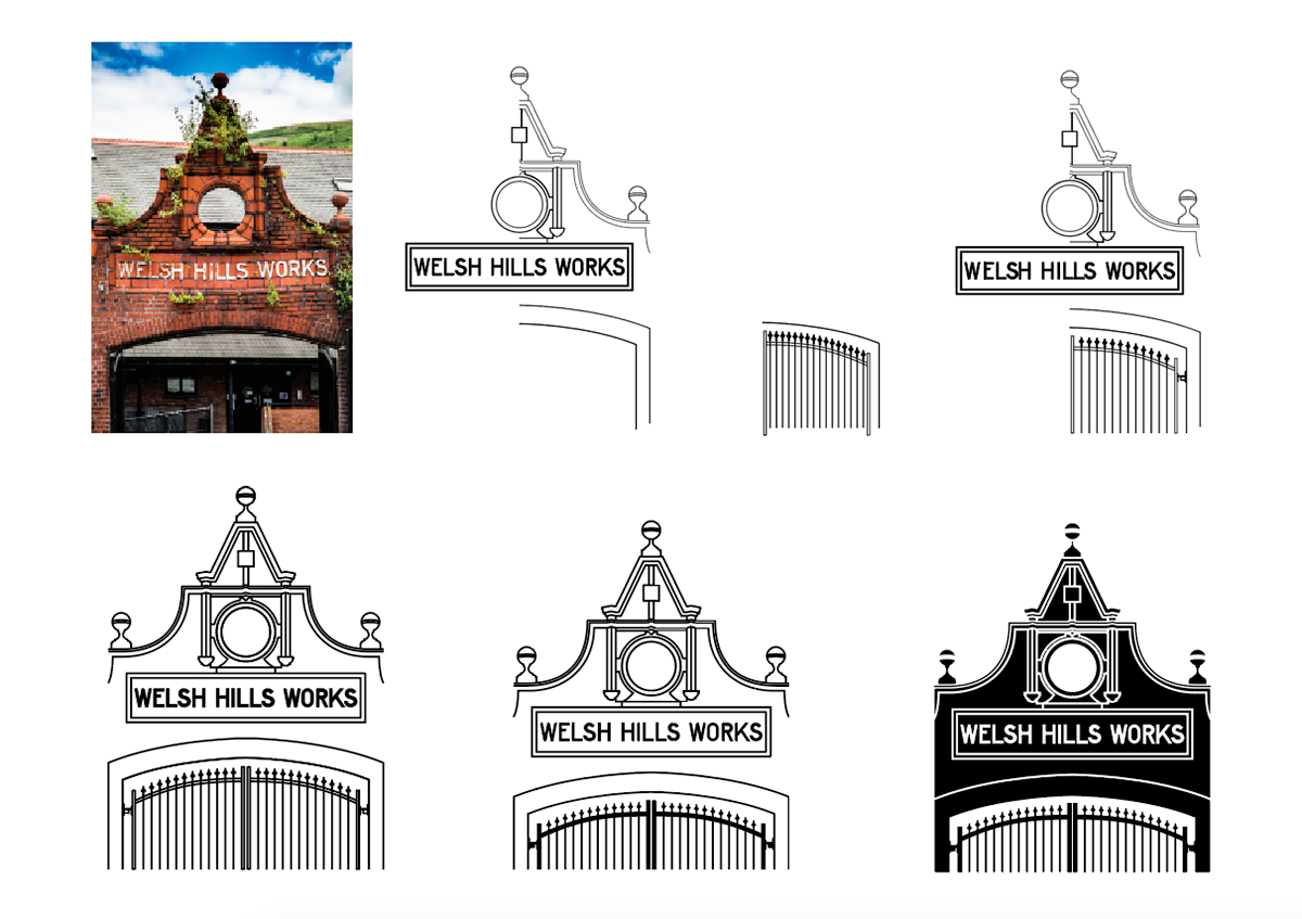
To complement this, each room required a door sign. As the signs were much smaller, I created simplified, logo-style versions of each landmark using only grey and white to ensure clarity and consistency.
...
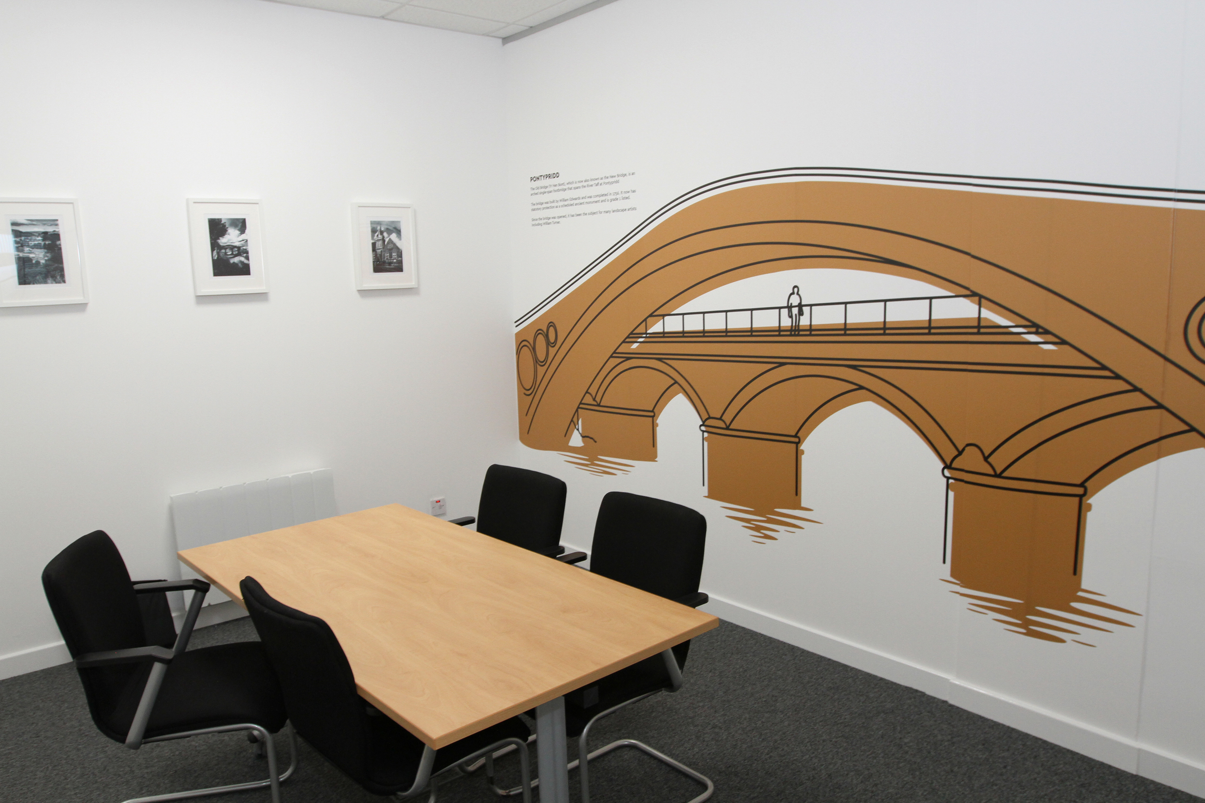
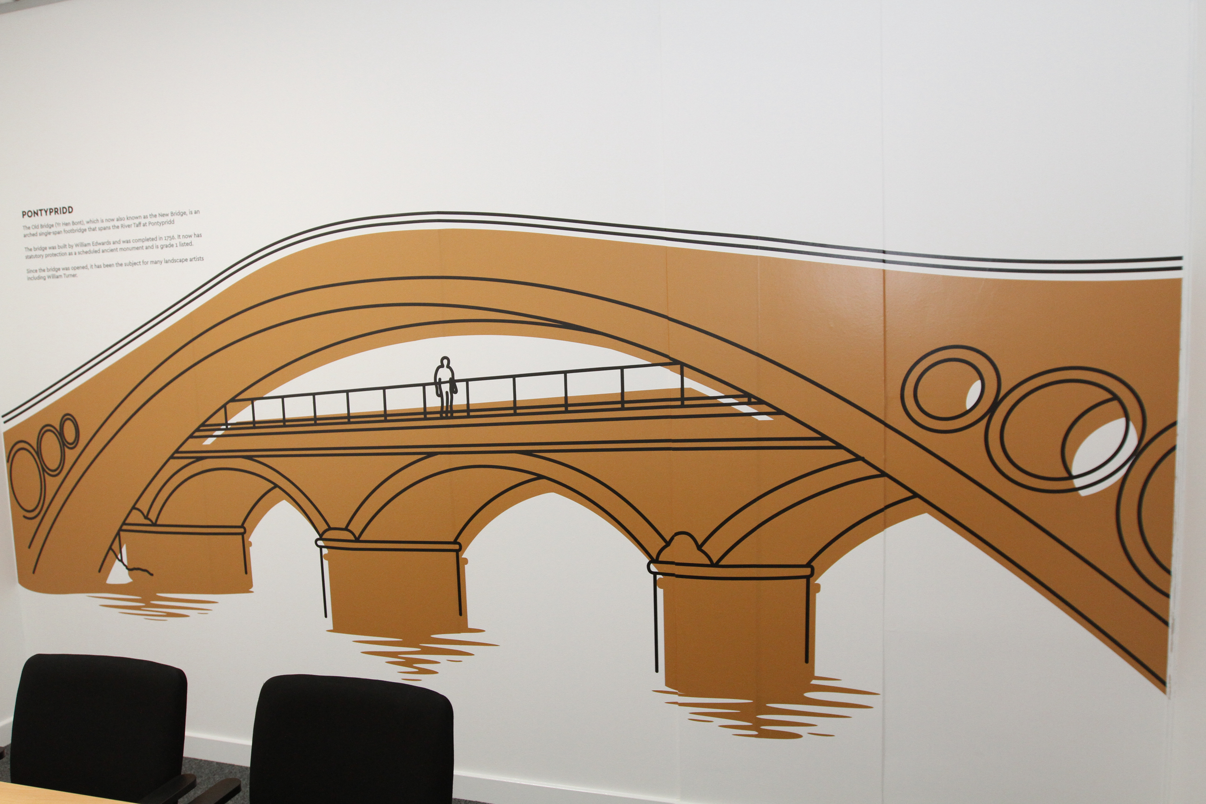
Level 5 - Pontypridd
This meeting room is based on Pontypridd town centre. The older bridge, built by William Edwards in 1756, is a grade 1 listed structure, and was joined by its counterpart in 1857 to improve goods transport.
I think this design is one of the most iconic in the set, as the circular details in the stonework make it easily recognisable to the local community. I particularly like how the figure in the centre of the design is framed by the bridges, while also providing a sense of scale. The contrasting door sign uses a side view of the bridge, incorporating the same distinctive circular motifs found in its structure.
Level 5 - Llwynypia
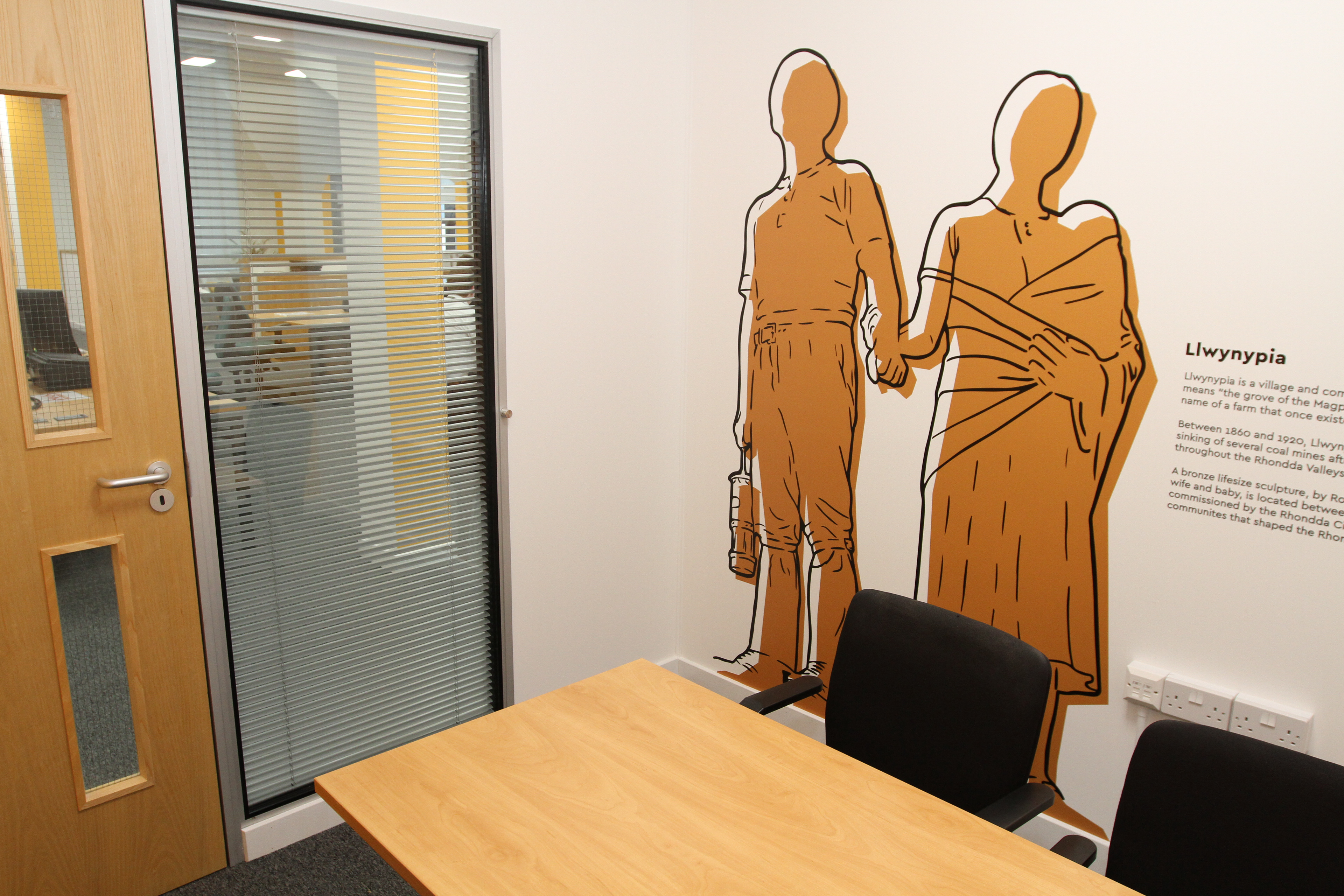
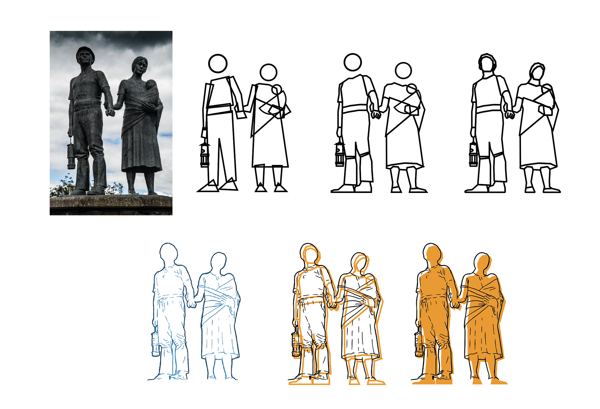
The second room on this floor was based on the Miners Memorial Statue in Llwynypia. The statue was created in 1993 by Welsh sculptor Robert Thomas to commemorate the multiple mining communities in the Rhondda valleys and featured a miner, his wife and their baby.
Unlike the more geometric shapes of the Pontypridd bridges, the natural forms and folds of the clothing required more detail to be included in the design. However, we decided to remove the detail from the faces to reinforce the commemoration of the mining communities. The contrasting sharp colour outline provided a crisp base for the darker details and linked to the door sign design.
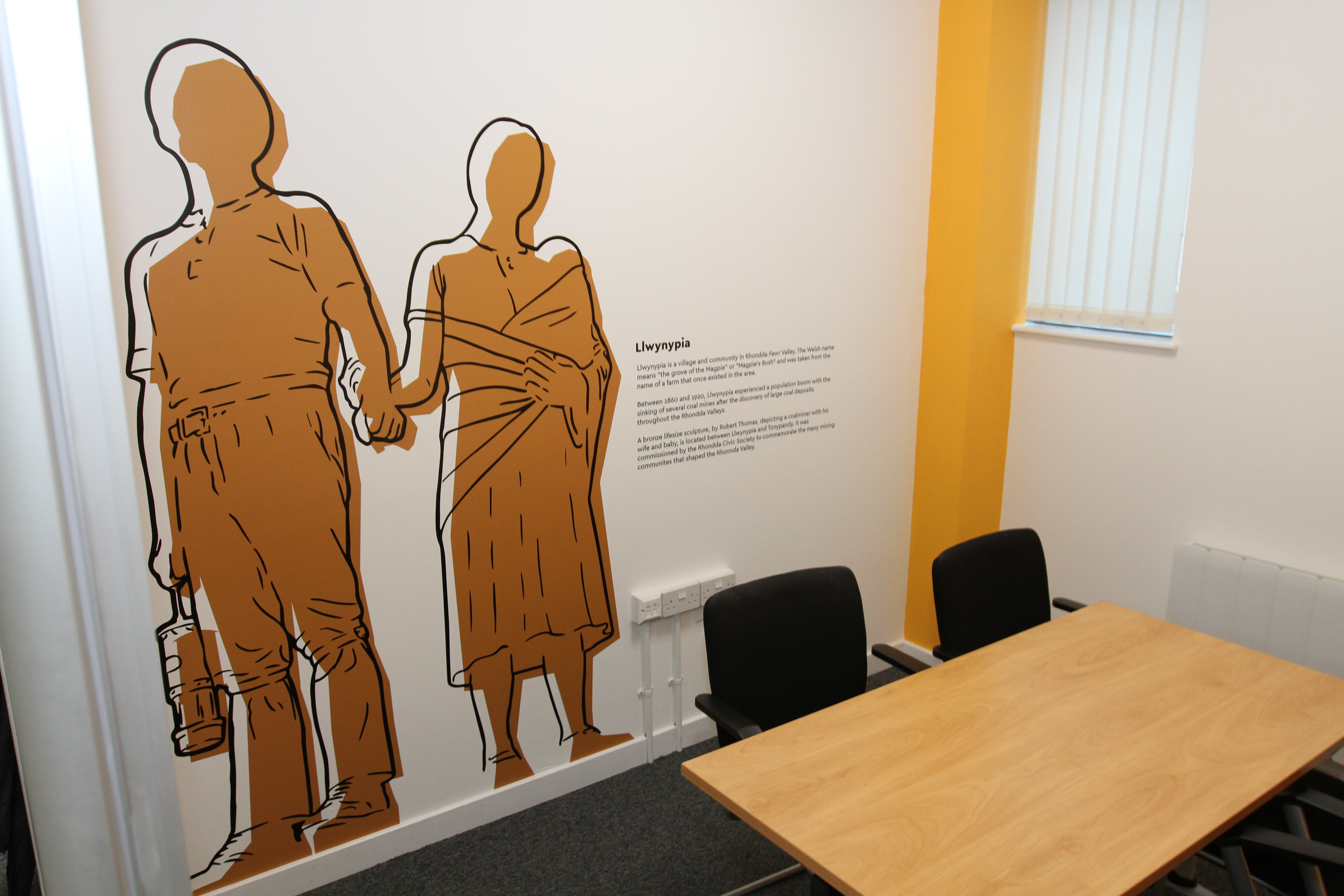
One of my favourite features of this floor is that the deep red colour scheme matches the real colour of the chosen landmarks.
Level 4 - Trehafod
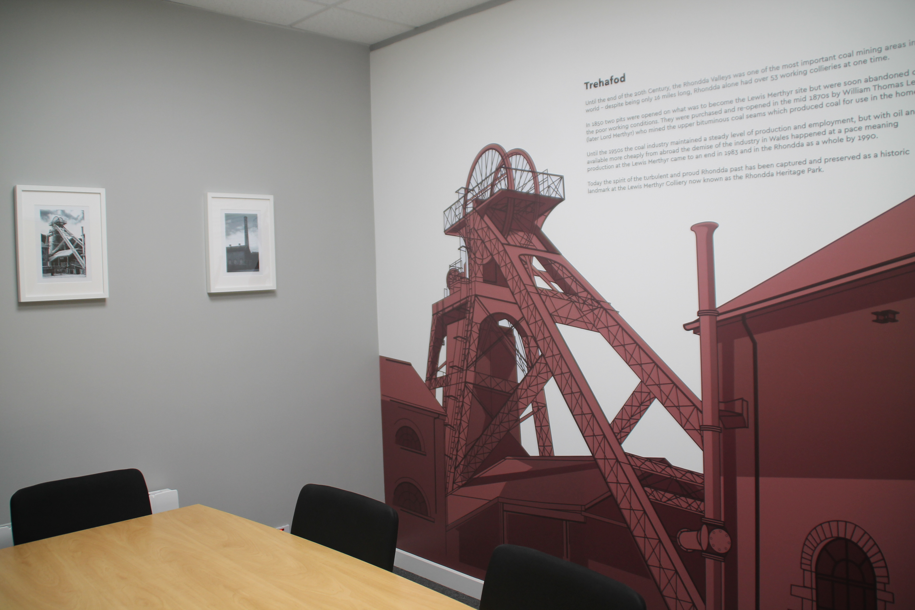
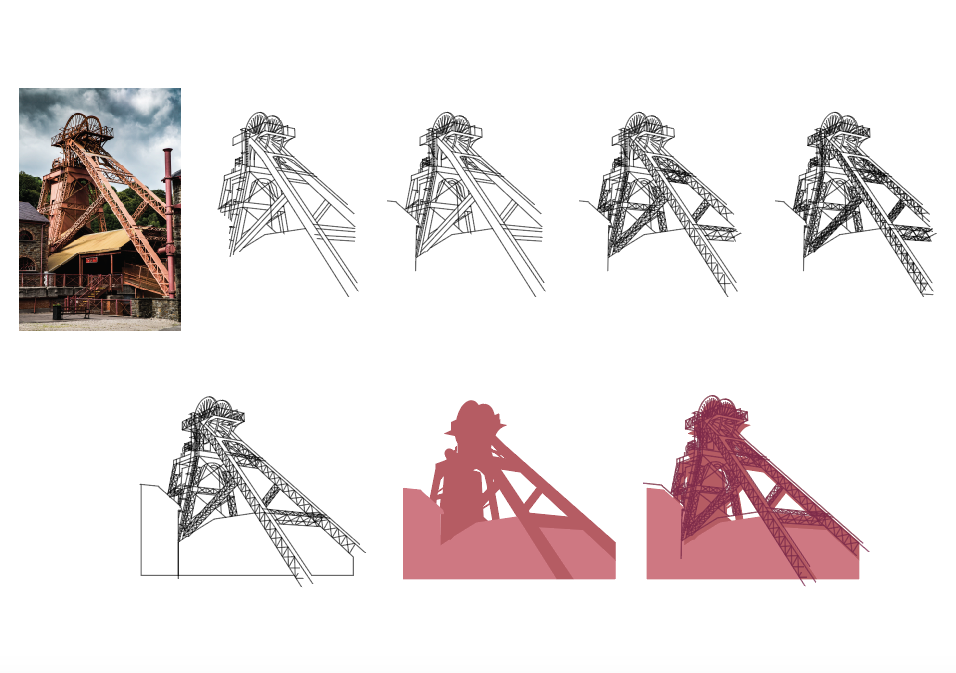
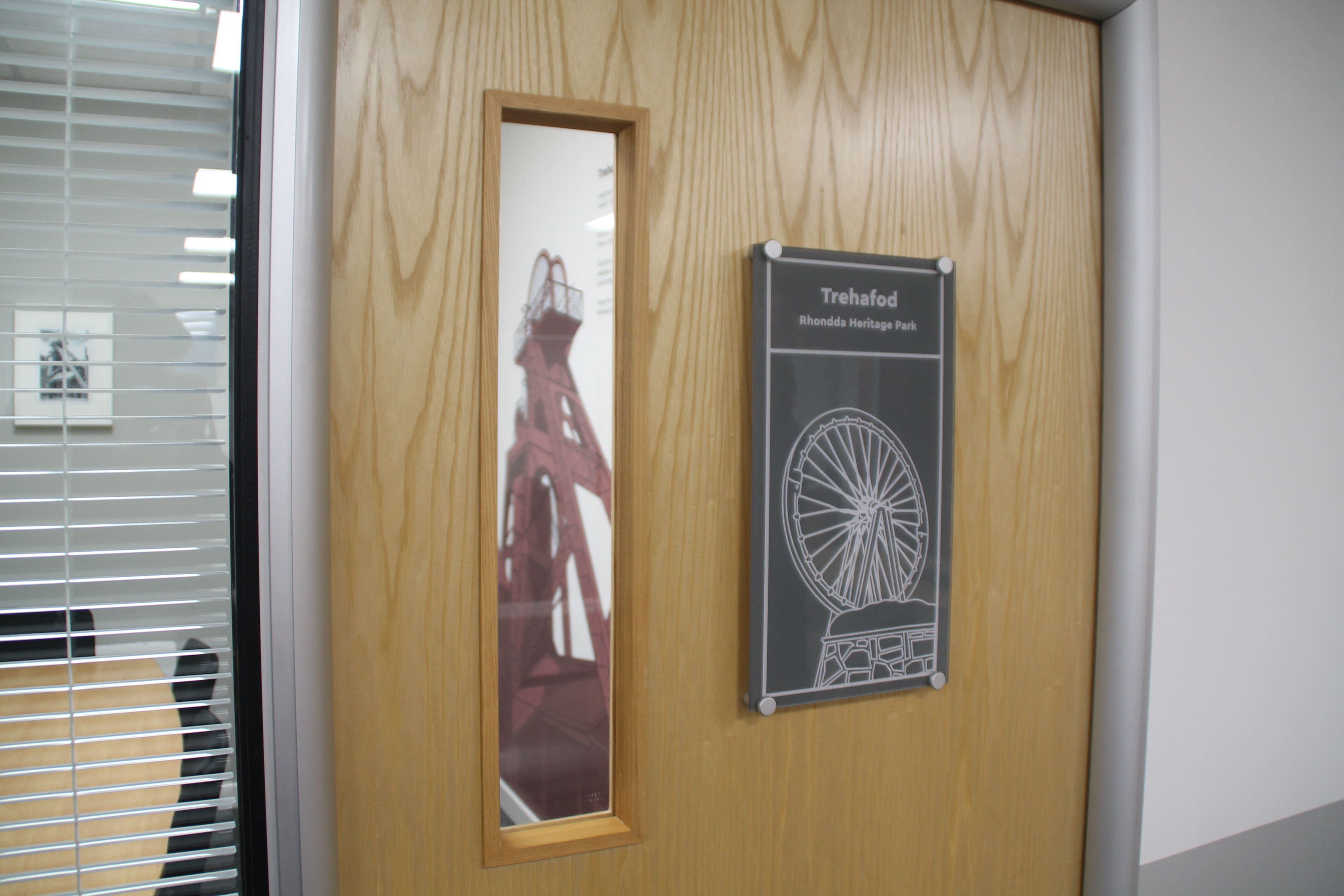
Based on the Rhondda Heritage Park in Trehafod, this meeting room was one of the last to be completed after I left Trivallis, and the design has since undergone the most change. My original design focused on the wheel tower and its intricate metalwork, kept narrow and box-shaped for placement on a smaller back wall.
Since it was moved to the larger right-hand wall, requiring it to be extended and reworked by the Trivallis media team. Additional surrounding buildings and details were added to provide context at a larger scale. While I was not responsible for the final colour scheme, I am eager to point out that the real tower is also painted a dark red.
Level 4 - Porth
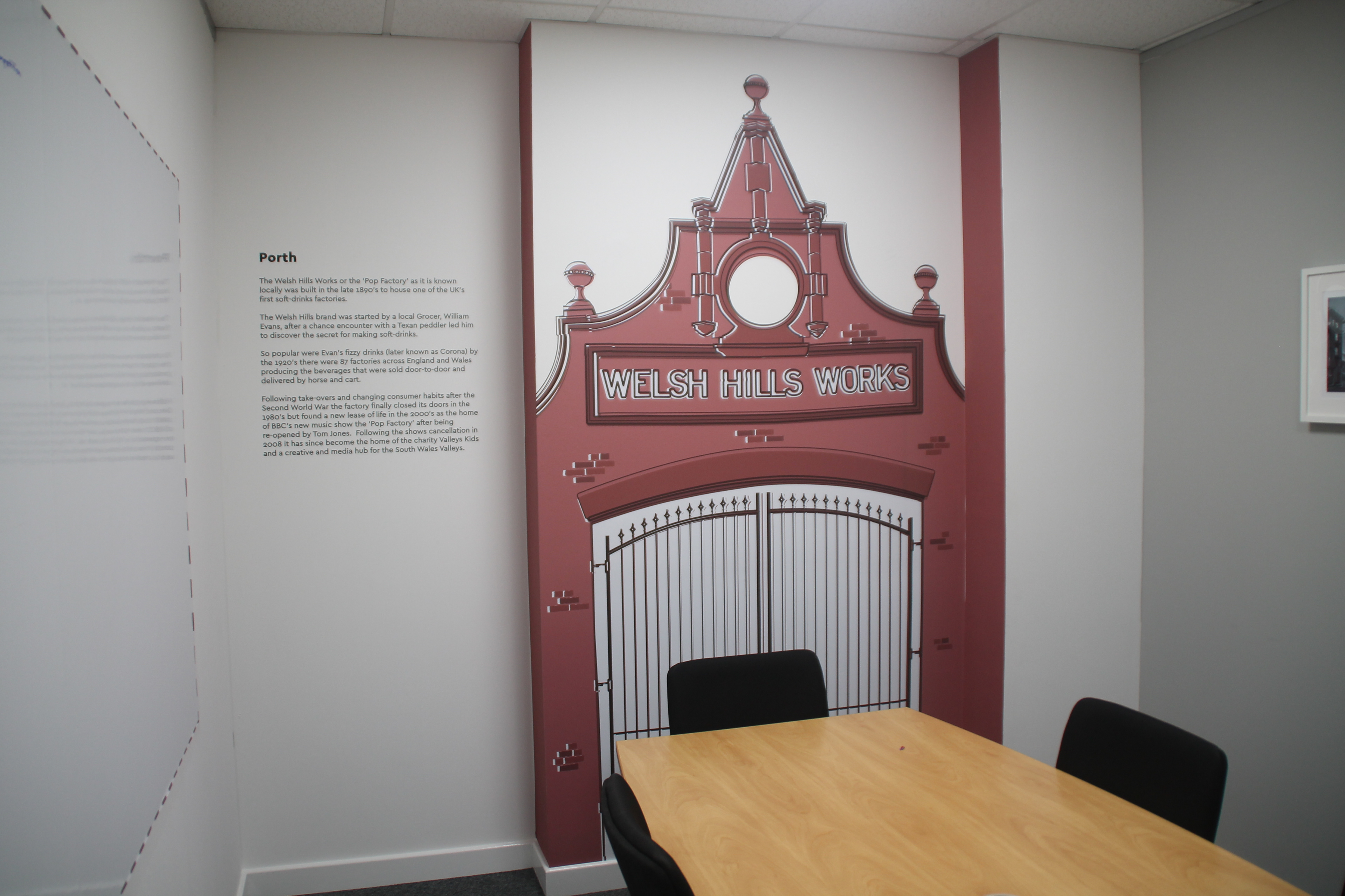
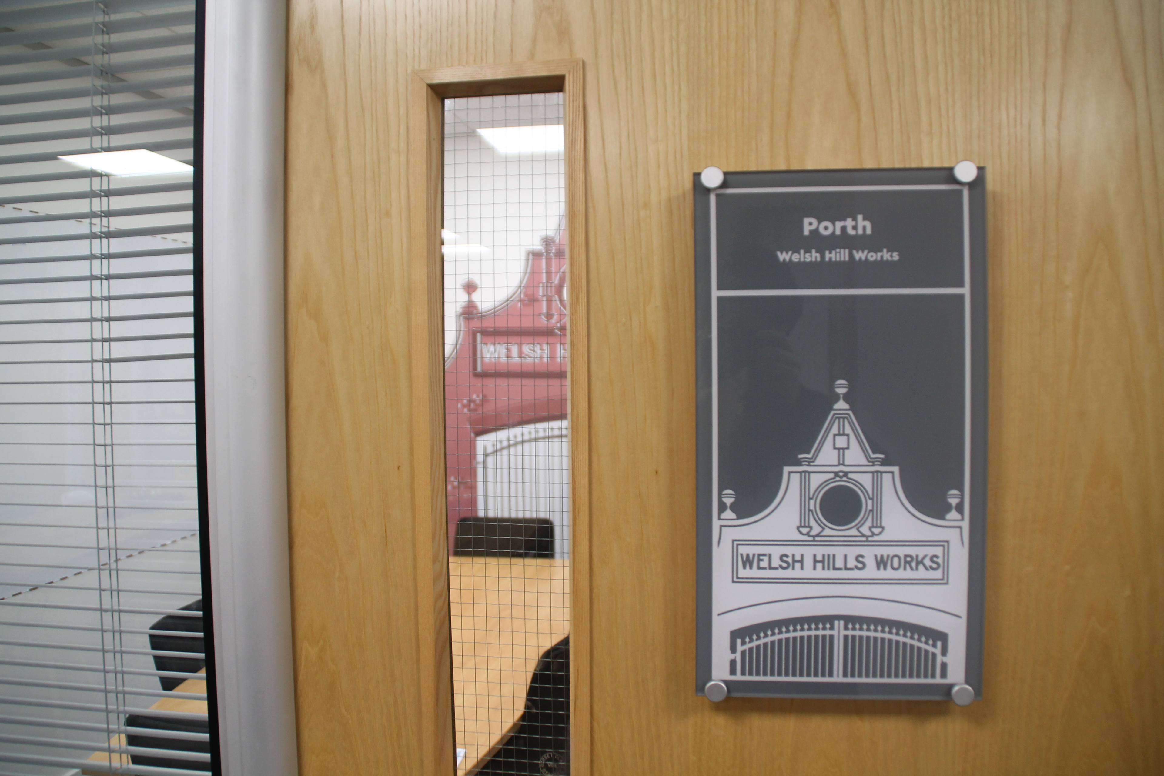
Like the other design on this floor, the landmark's real colour is reflected in the design, in this case through the red bricks of the Welsh Hill Works gate. The composition fits well within the room's shape, particularly as the actual site is surrounded by buildings and trees.
While the door and wall decal closely match, the larger decal required additional details to emphasise the brickwork. Adding spots of darker bricks and highlighting important elements of the gate gave the design a more 3D aspect. Similar to the Rhonda Heritage Park meeting room, this decal was also finalised by the Trillavlis media team, who refined colours and adjusted placement and scale.
Level 3 - Caer Rocks
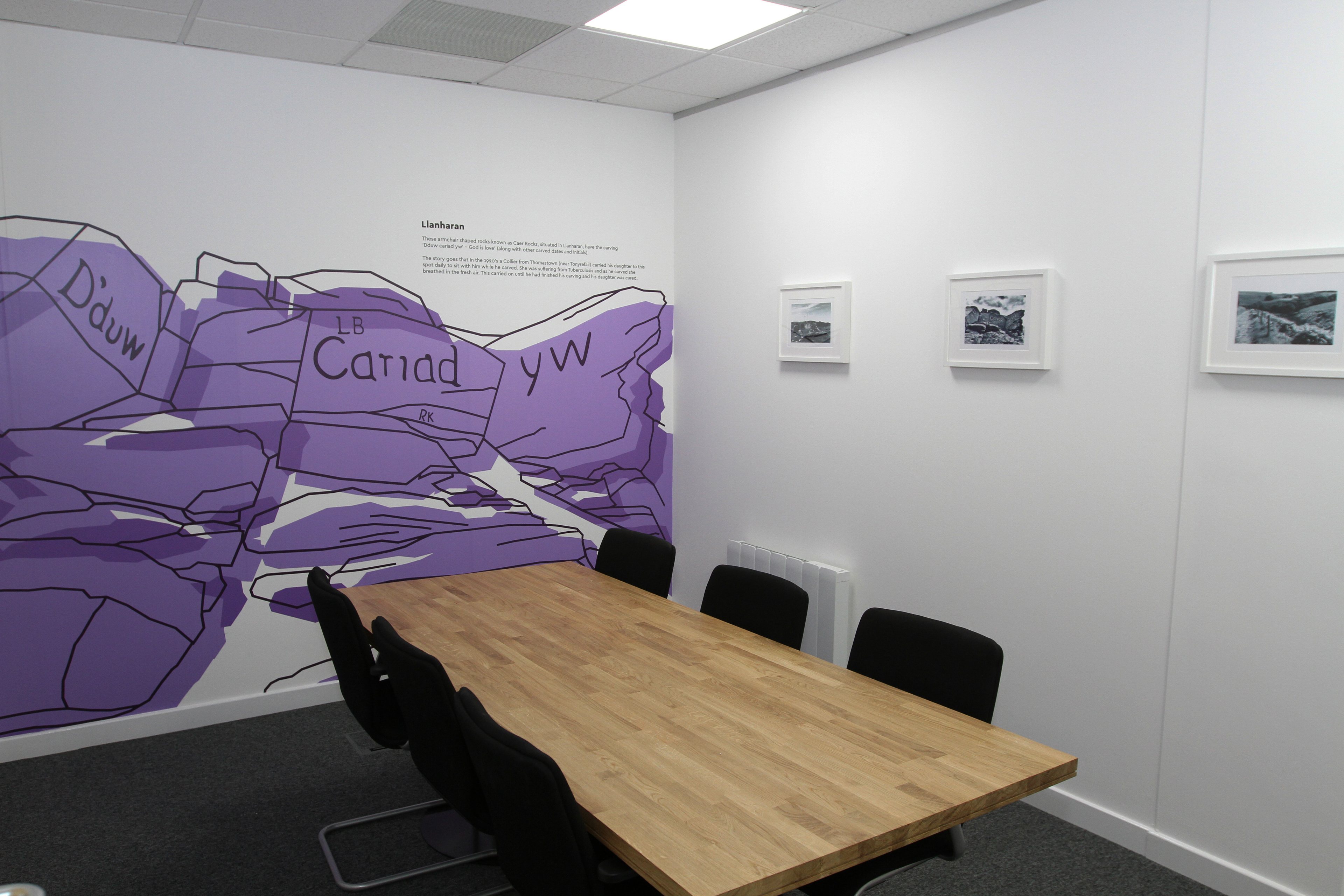
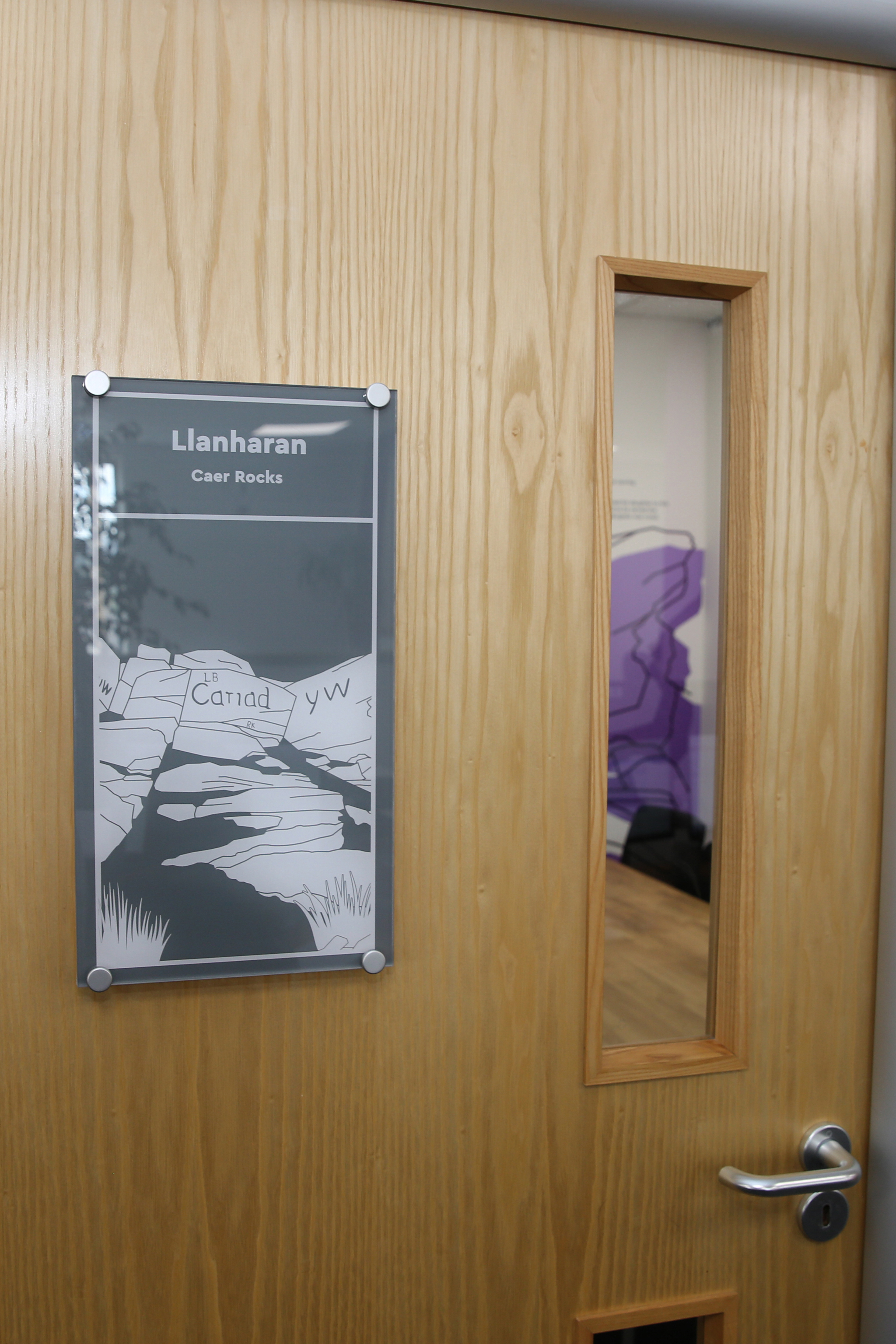
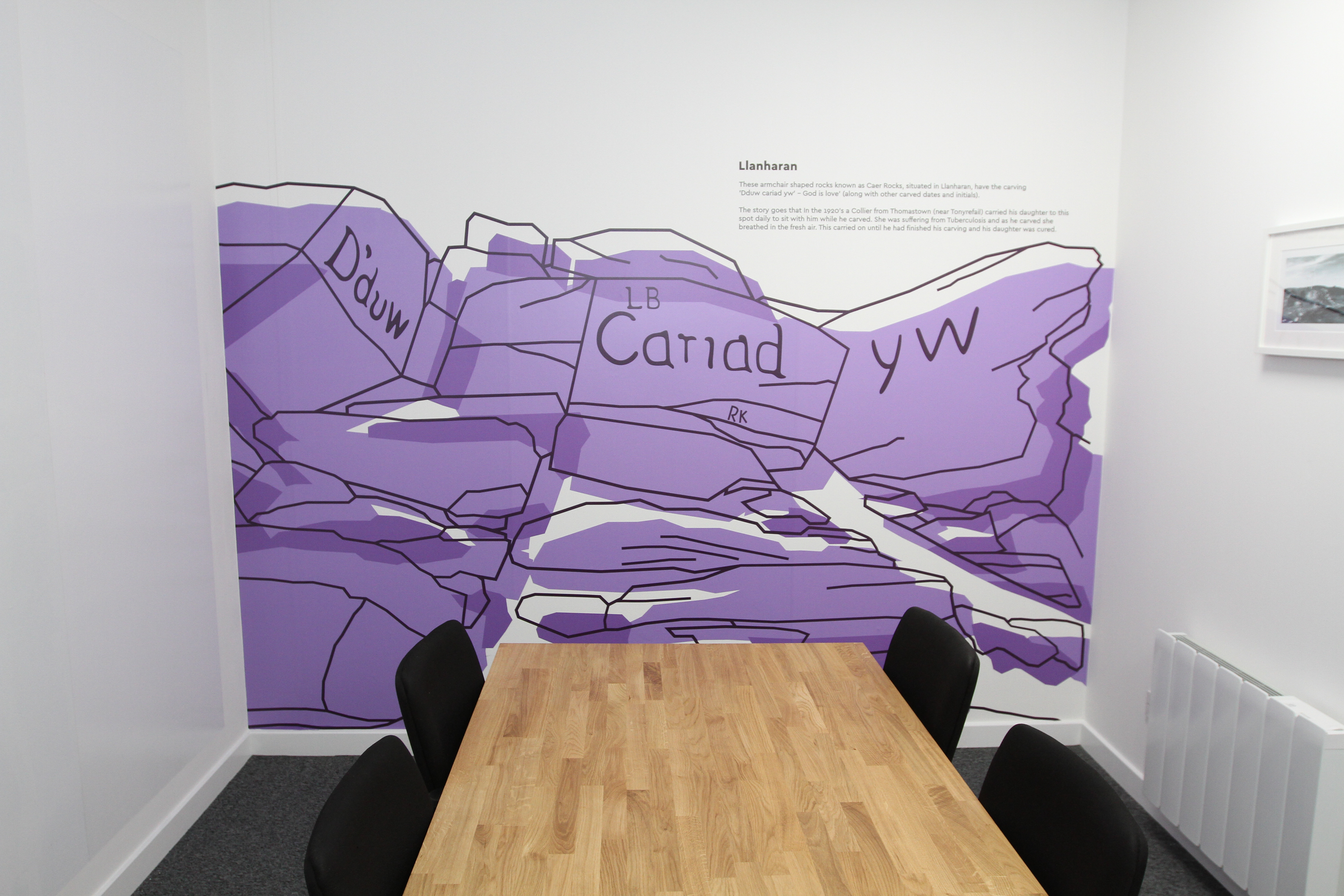
This room is based on the Caer Rocks, a rock formation above Llanharan, engraved with the words "God Is Love". One local legend tells of a father who brought his sick daughter to the site daily for fresh air while carving "Dduw cariad yw" into the stone. When he was finished carving, she was cured.
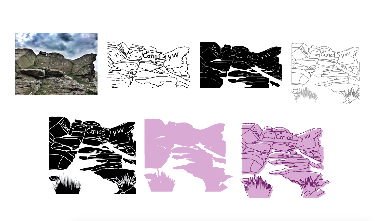
The design presented challenges due to the lack of clear features, making the landmark difficult to recognise. To address this, I added visible cracks, natural stone lines and used two tones in the background to create a sense of depth. The result of this design is rather impactful and adds a strong presence to the room. This design is specifically connected with Trivallis as the original photo was taken by a staff member who visited the landmark.
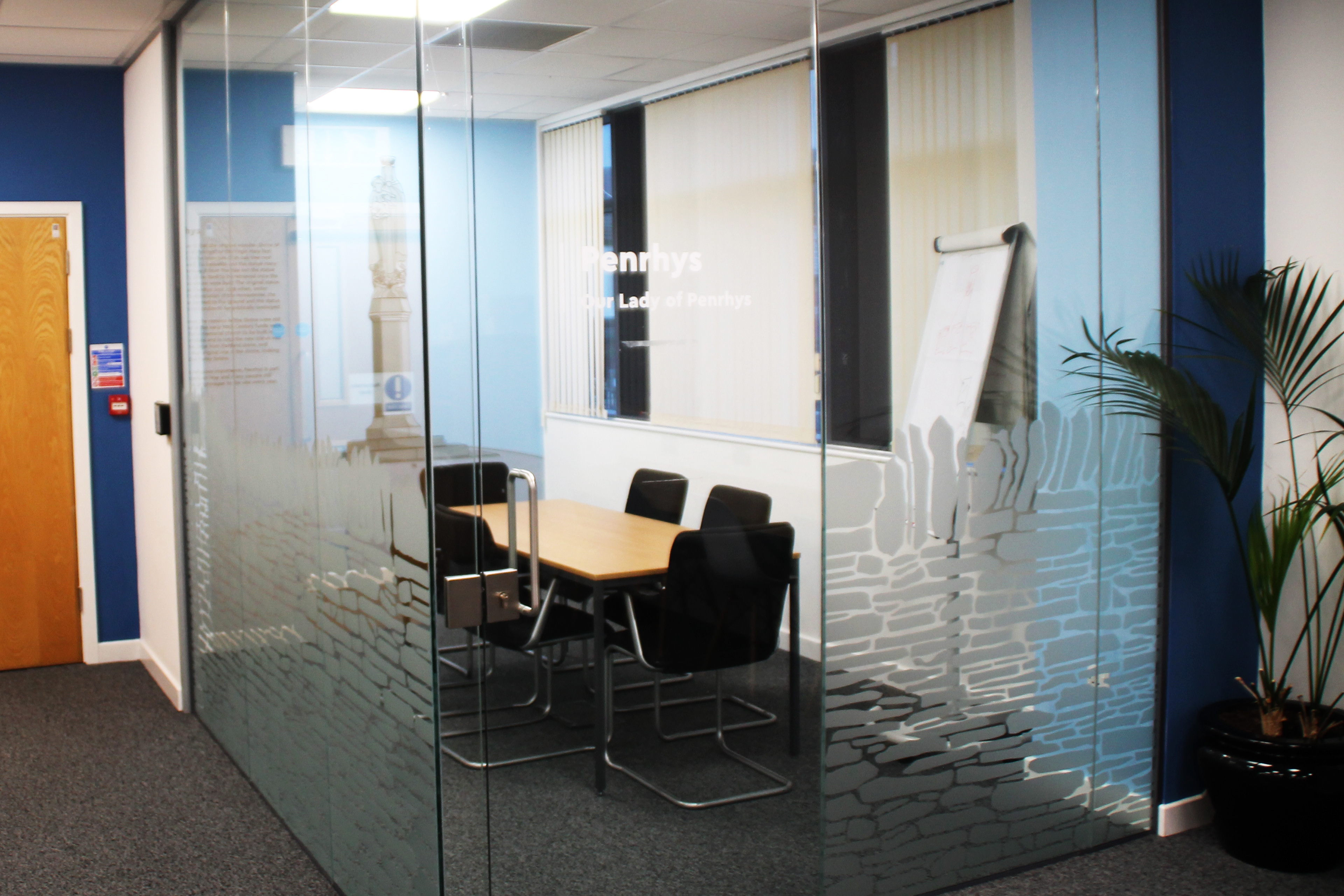
Level 1 - Penrhys
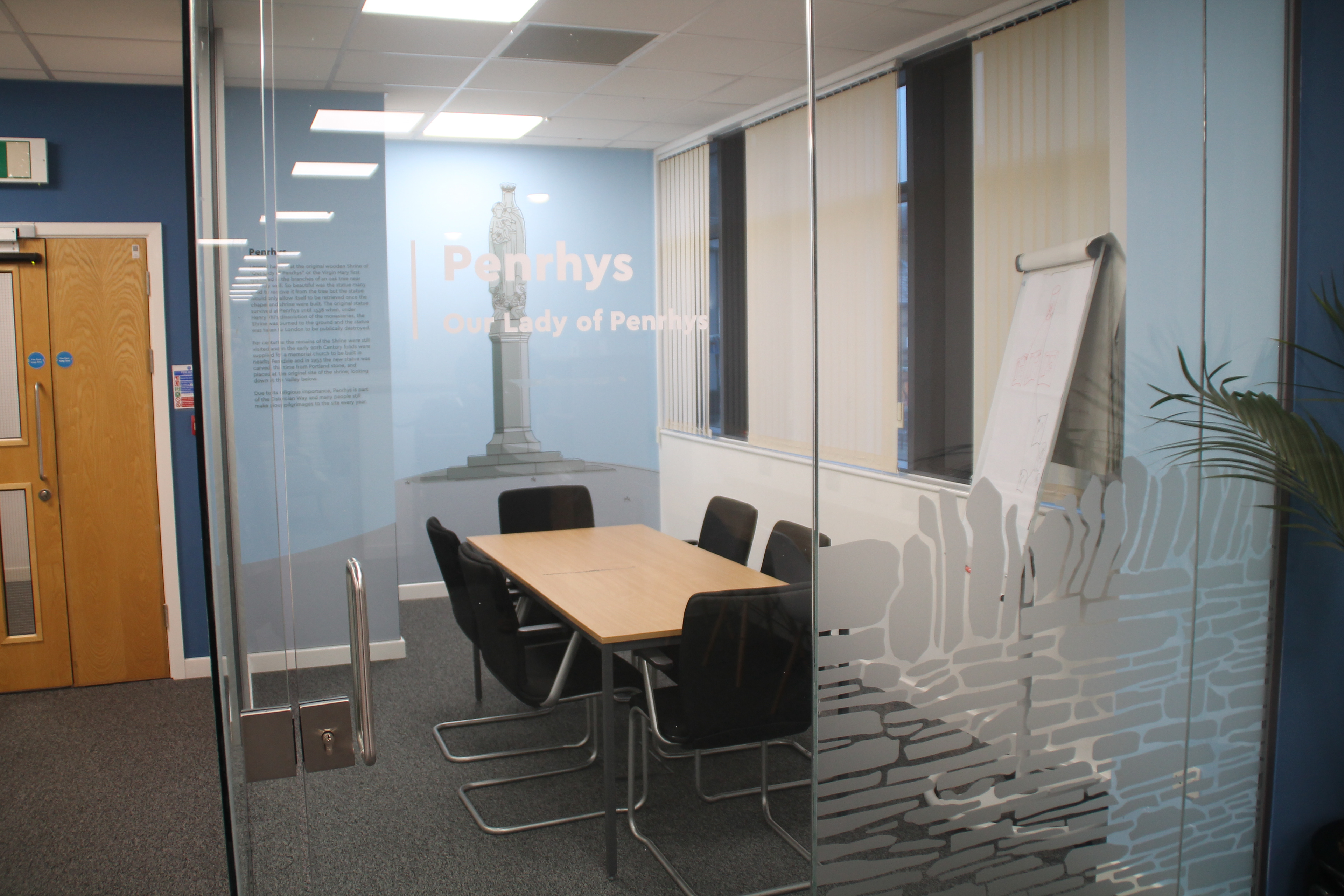
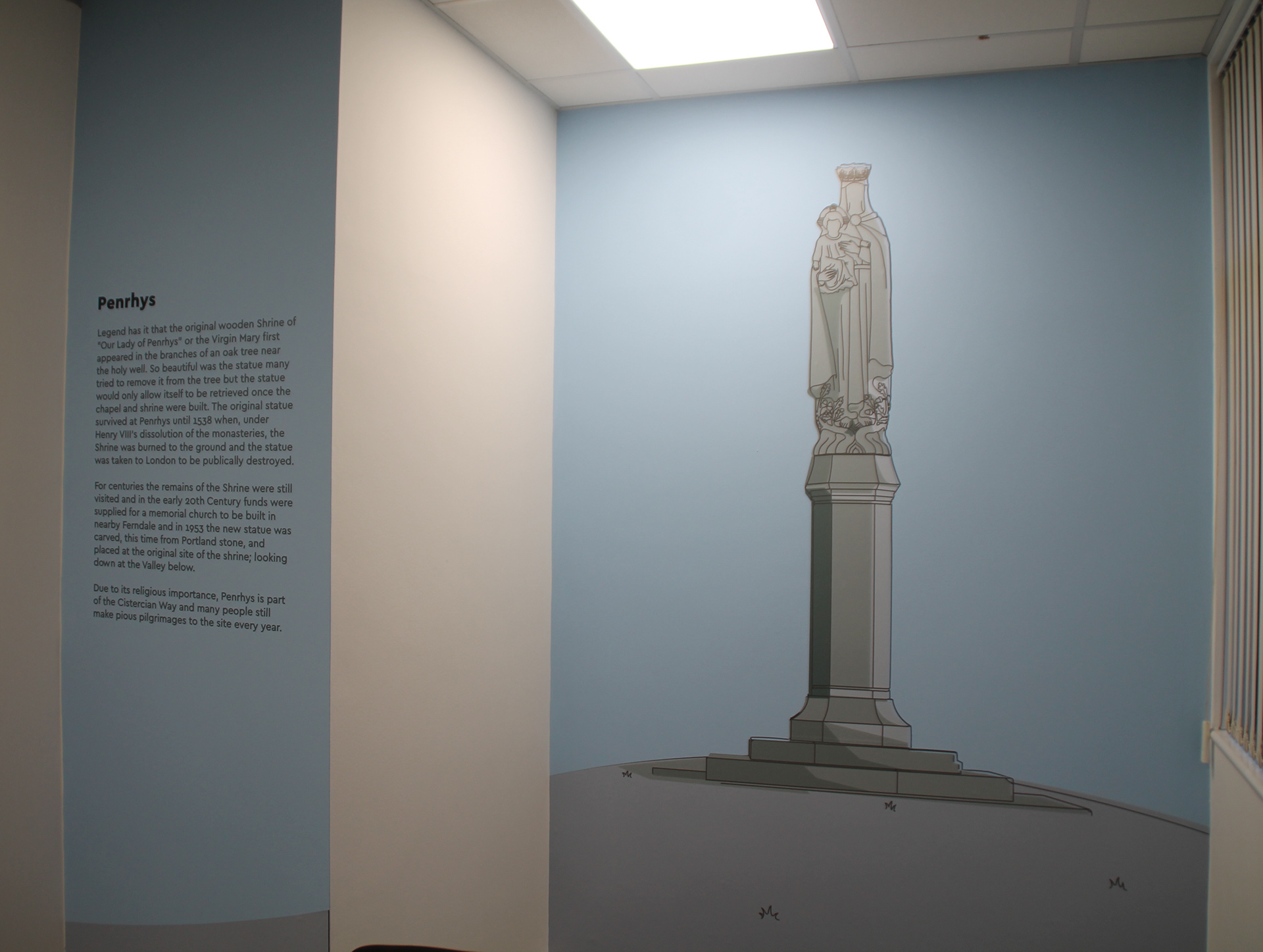
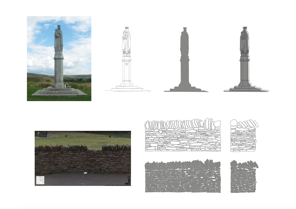
Unlike the other meeting rooms, this room was made of glass, allowing us to use its depth and perspective in the design. The landmark chosen was the Lady of Penrhys, a statue that represents an old fable. Research showed that it sits on a hillside surrounded by an old stone wall.
To recreate this, the design of the statue would be placed on the back wall, while a stone wall design was placed on the surrounding glass, creating a closer representation of its real setting. As the design was clearly visible from outside the room, the door only required the name.
Final details, including shadows, the grey hillside and grass elements, were added by the Trivallis team after I had left.
This project is one of my favourites so far, and I would like to thank Trivallis and all its staff for letting me be a part of it.
Finally, please visit my projects page to see my work on the Trivallis reception area.