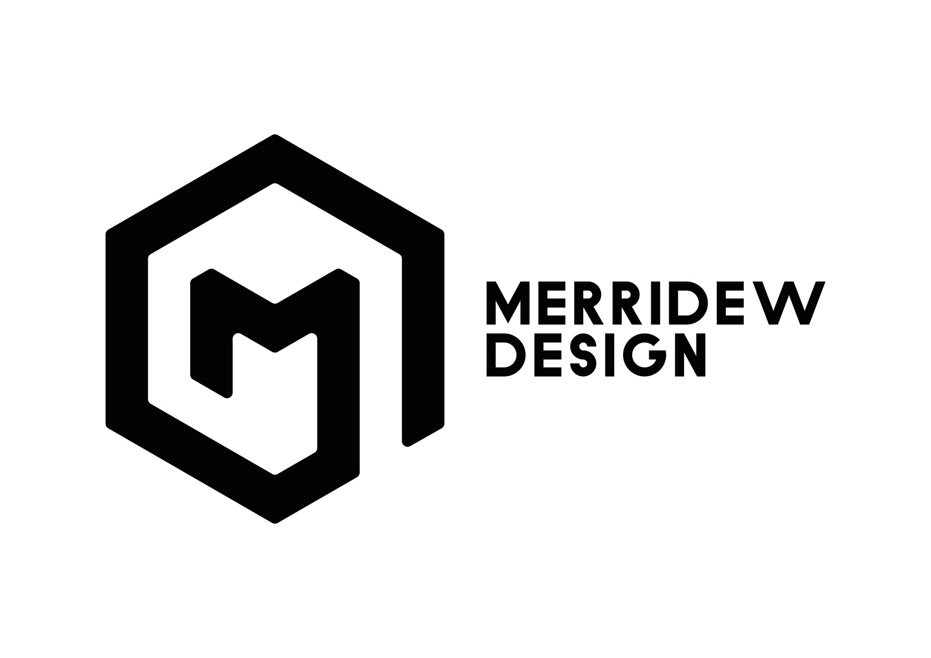
This icon reflects my passion for precise vector graphics, using a strong yet simple shape that can be recognised quickly. The design also incorporates an “M”, allowing it to stand alone without the brand name while still remaining clearly identifiable and personally distinctive to me.
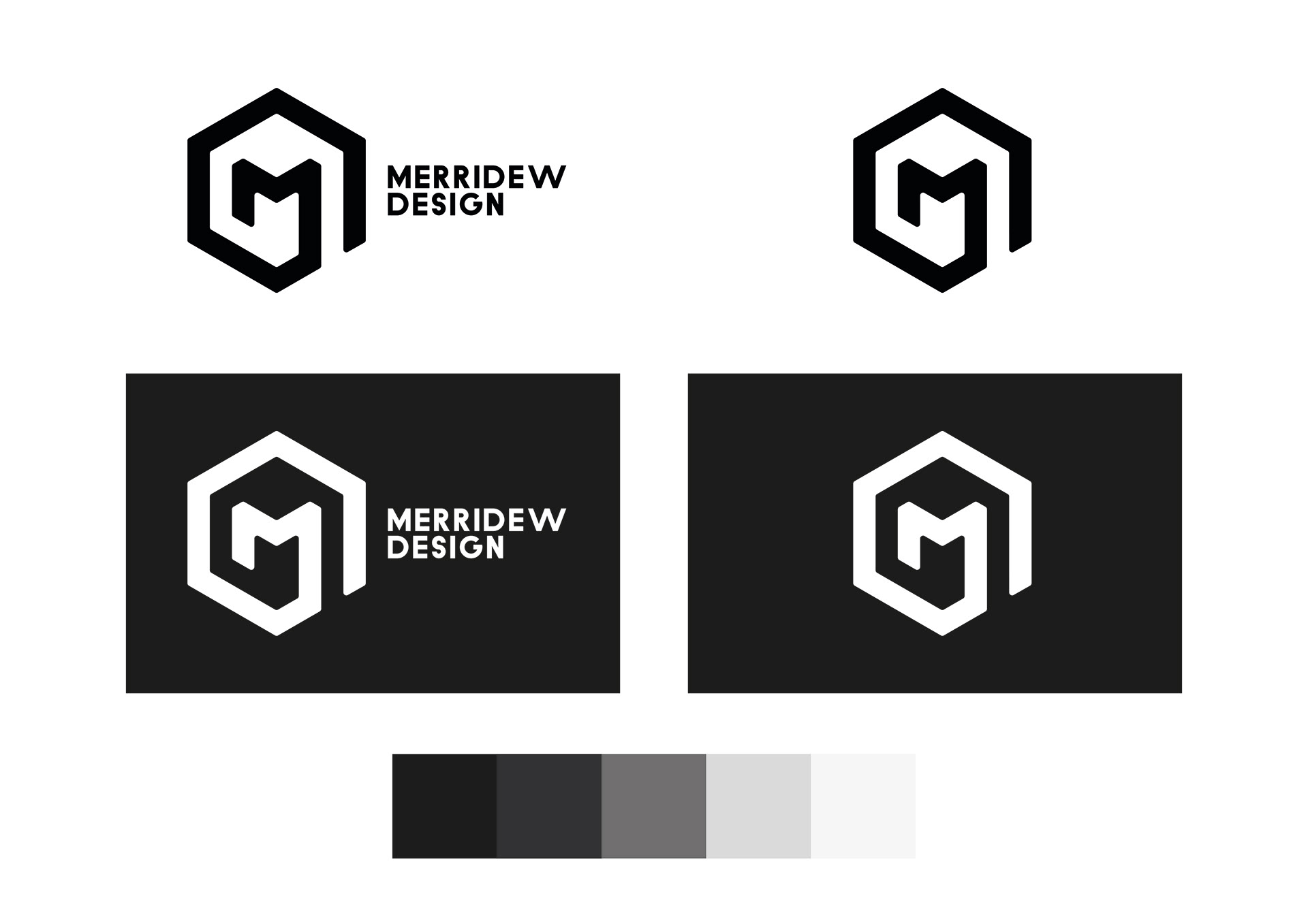
The contrasting colours allow for crisp visuals but keeps the focus on my work for other clients rather than my own branding.

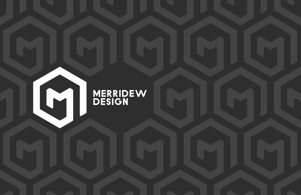

Designing my business card gave me the opportunity to play with the patterns that my logo allows.

My branding has since changed to "Martyn Merridew"