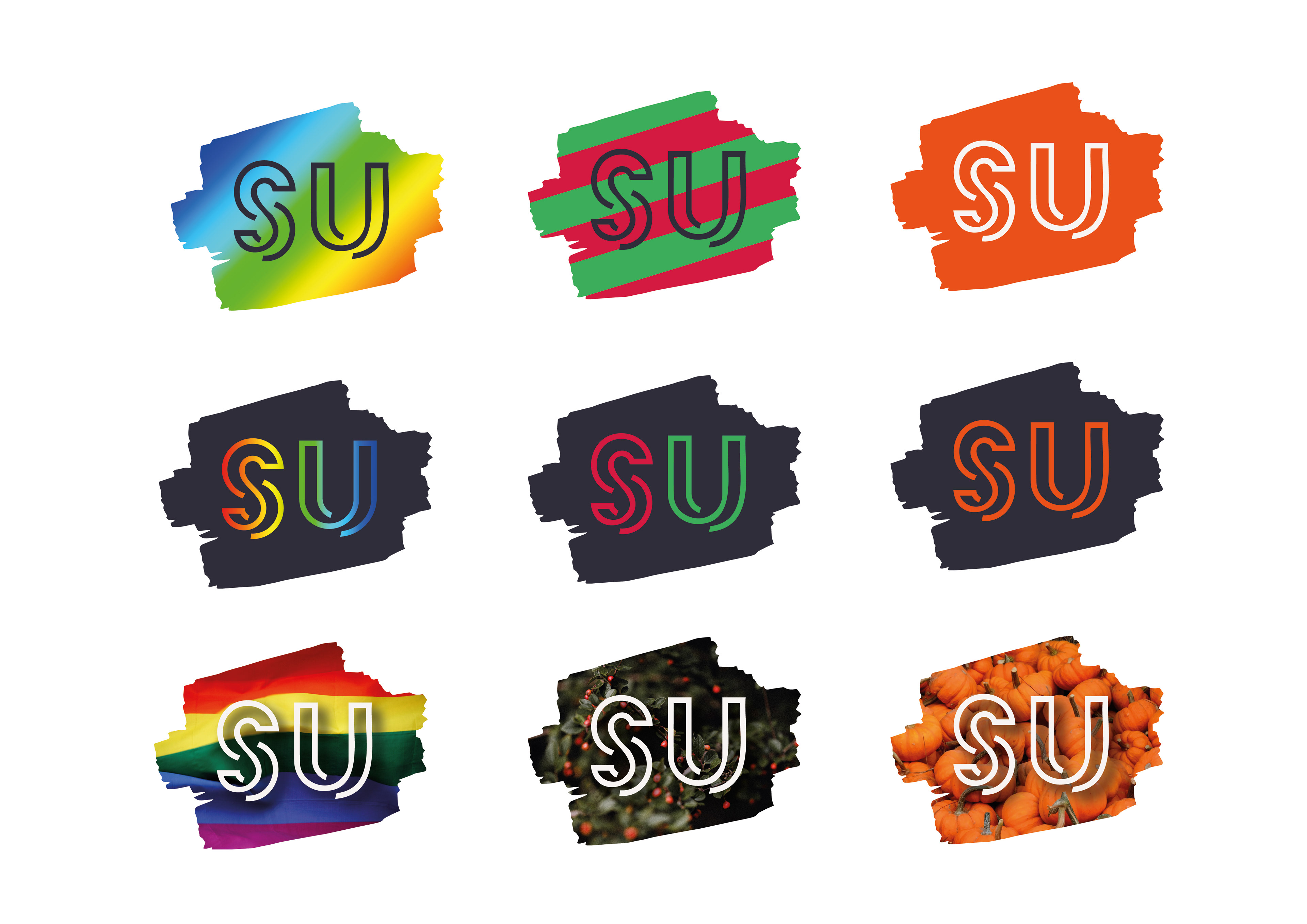
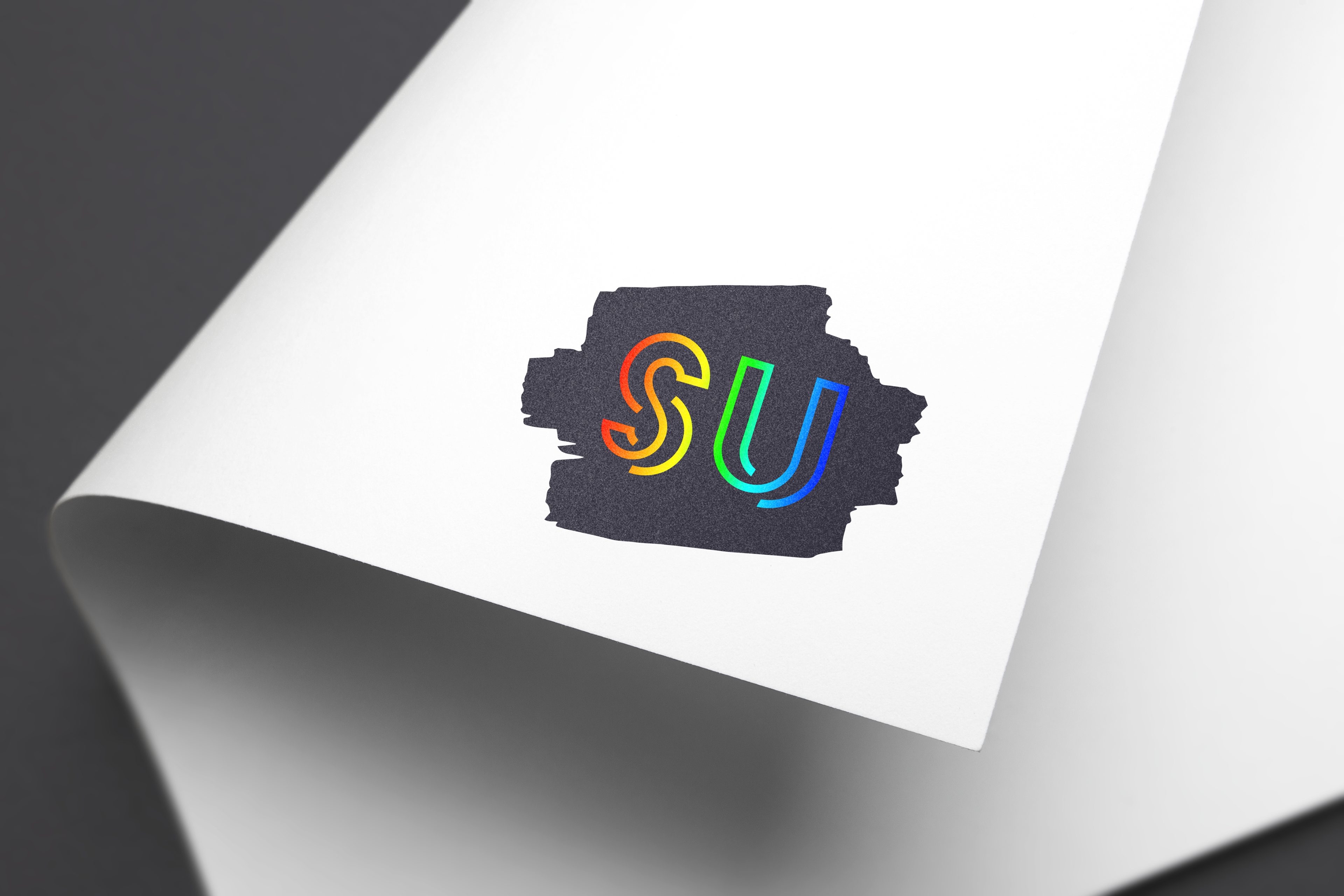
The Student Union at Hereford College of Arts was given a rebrand, and I aimed to create something inclusive, creative, versatile and recognisable. As a creative college, it was important that the logo encompassed all of these qualities.
Several versions of the logo were created for use across multiple formats, including prospectuses, signage and social media. The design was developed with the college’s main branding in mind, ensuring consistency across all applications.
Typeface choices and paintbrush stroke imagery were used to maintain a cohesive visual theme throughout the college. This helped give the Student Union instant credibility and value by closely aligning it with the wider institutional identity, improving on the disconnect seen in the previous brand.
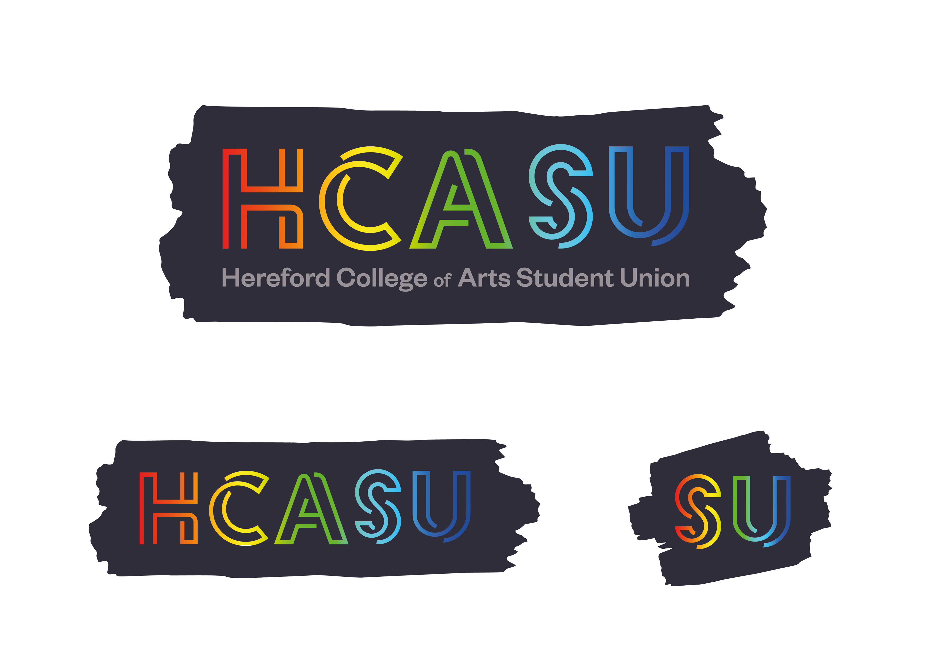
I wanted the logo to feel versatile and fun, so I created multiple variations for different contexts, including holidays, Pride and more general seasonal or event-based adaptations, ensuring the identity could remain dynamic and recognisable throughout the year.