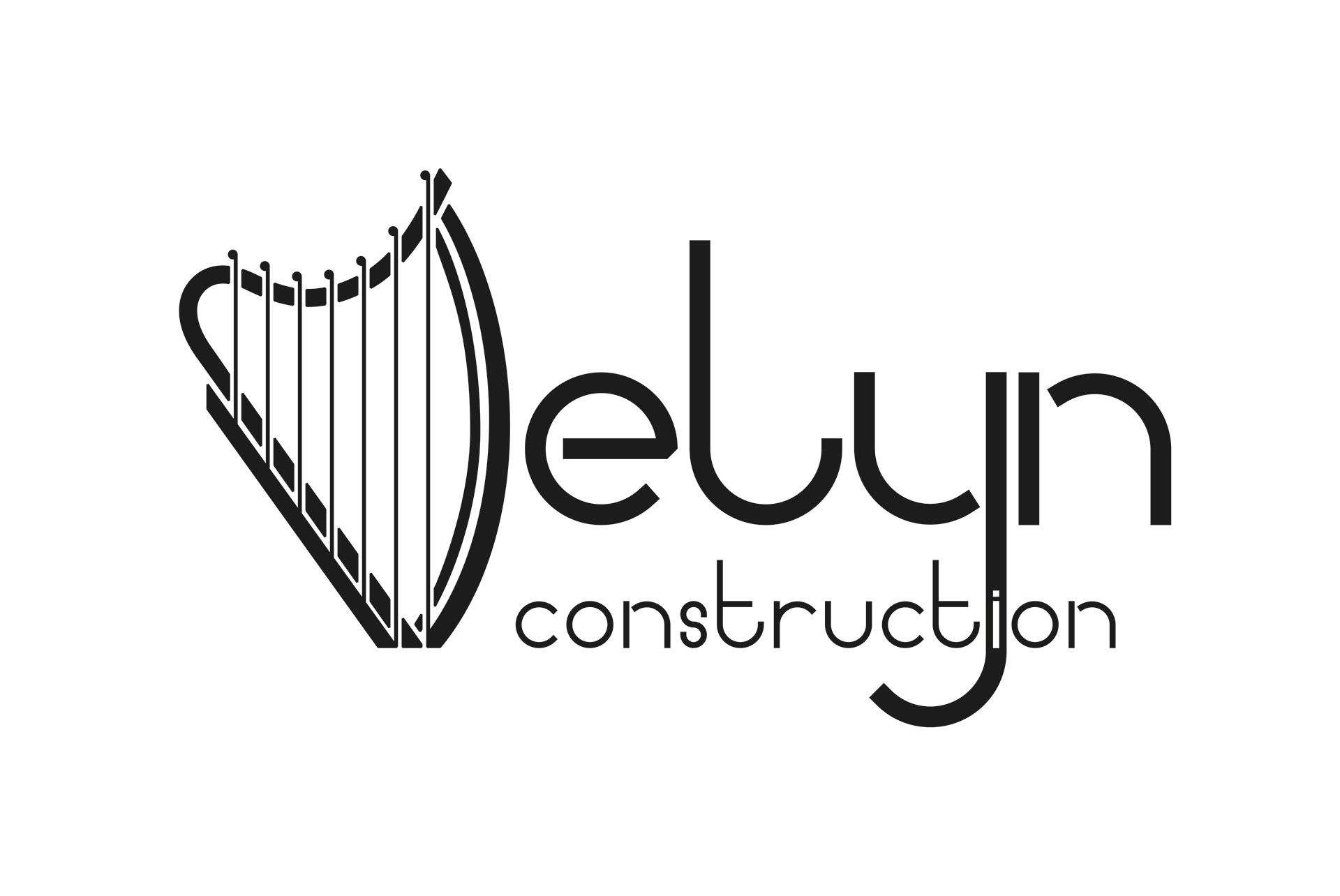
Full branding project for a South Wales construction company - Delyn Construction.
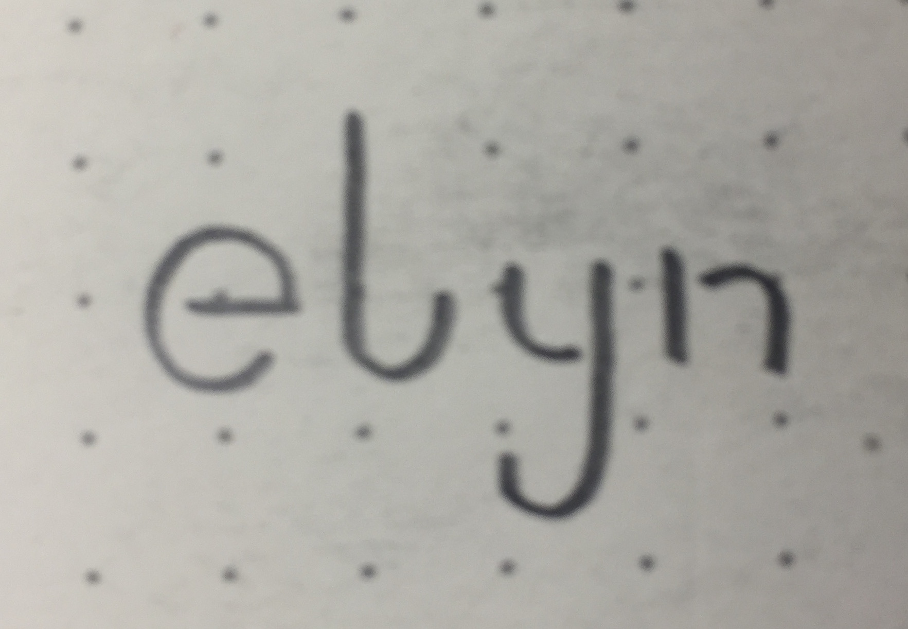
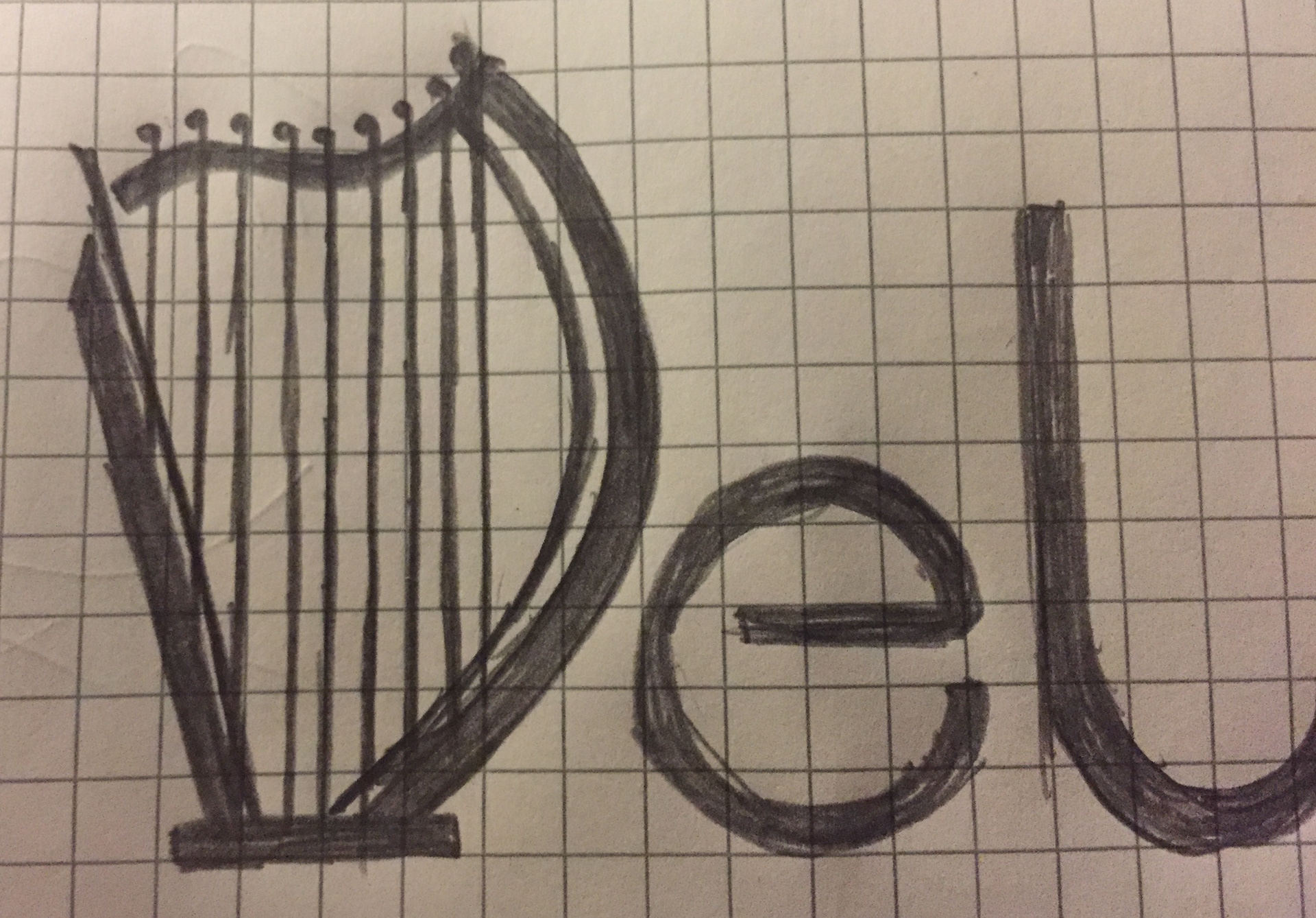
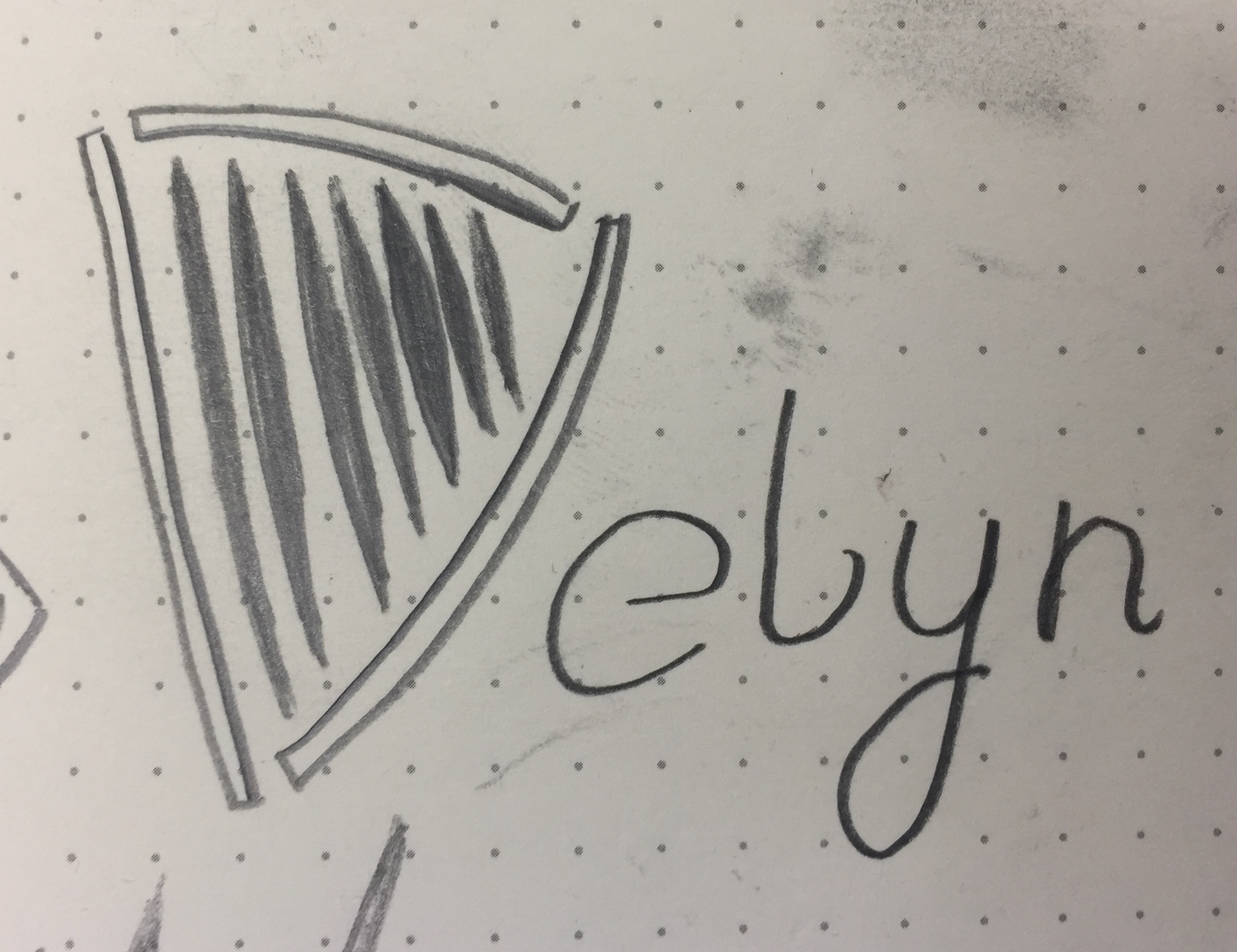
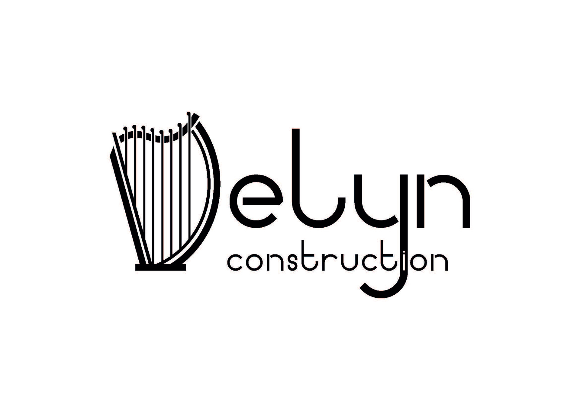
Delyn means harp in Welsh, so I sketch ideas with the 'D' in Delyn as a harp.
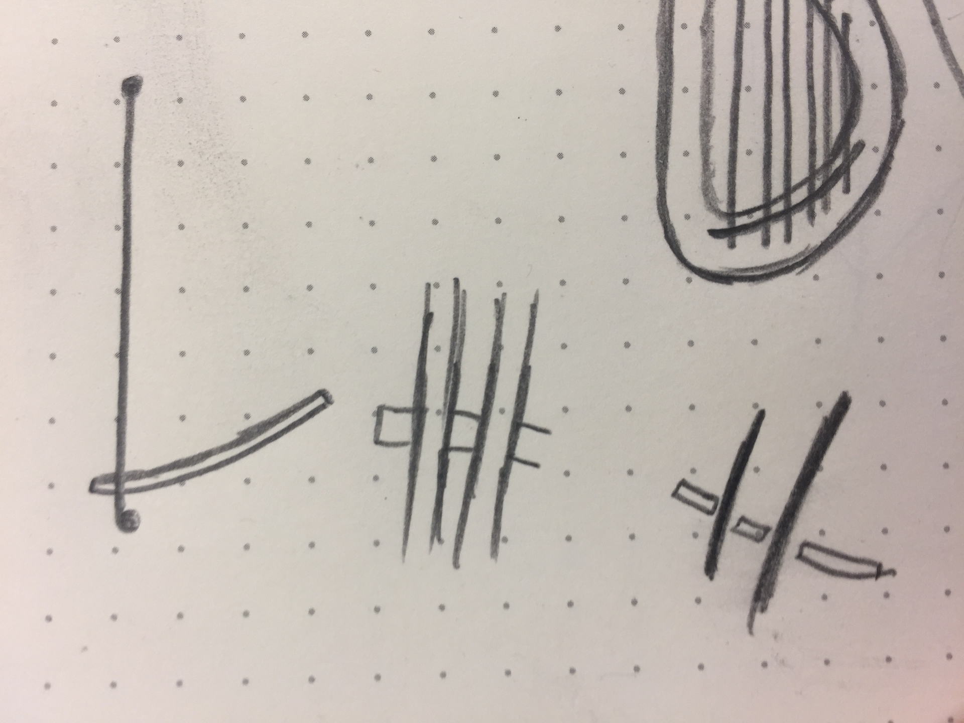

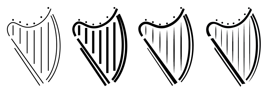

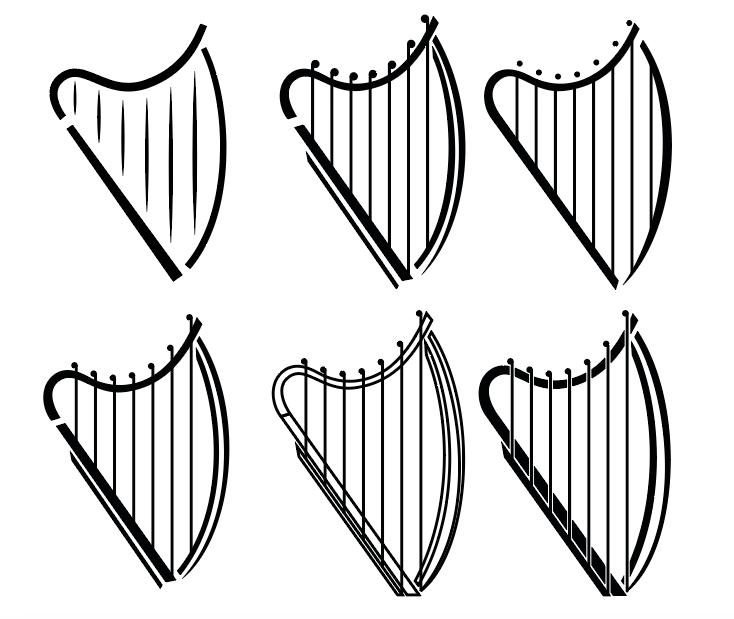
Initial design development.
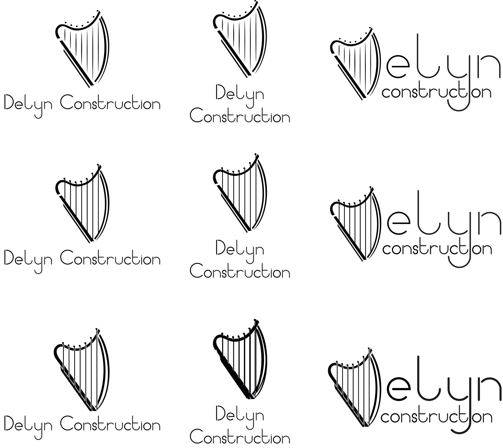
Researching construction logo colour tropes I make a few different colour options as well as using colours from the Welsh flag.
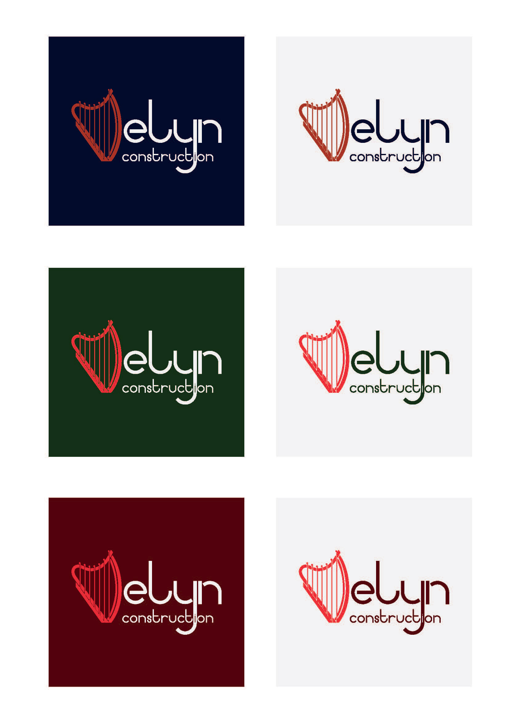
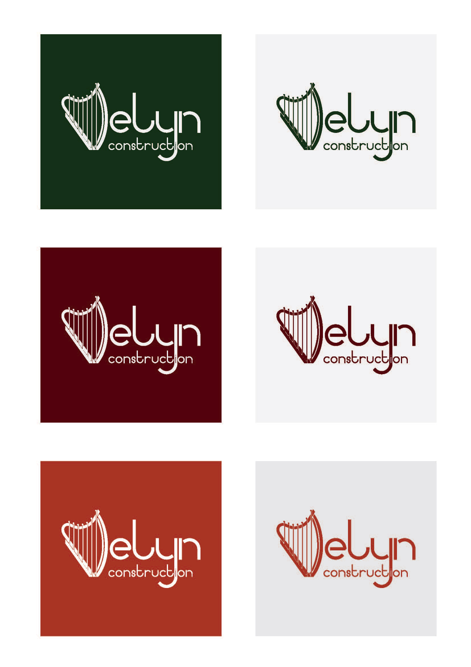
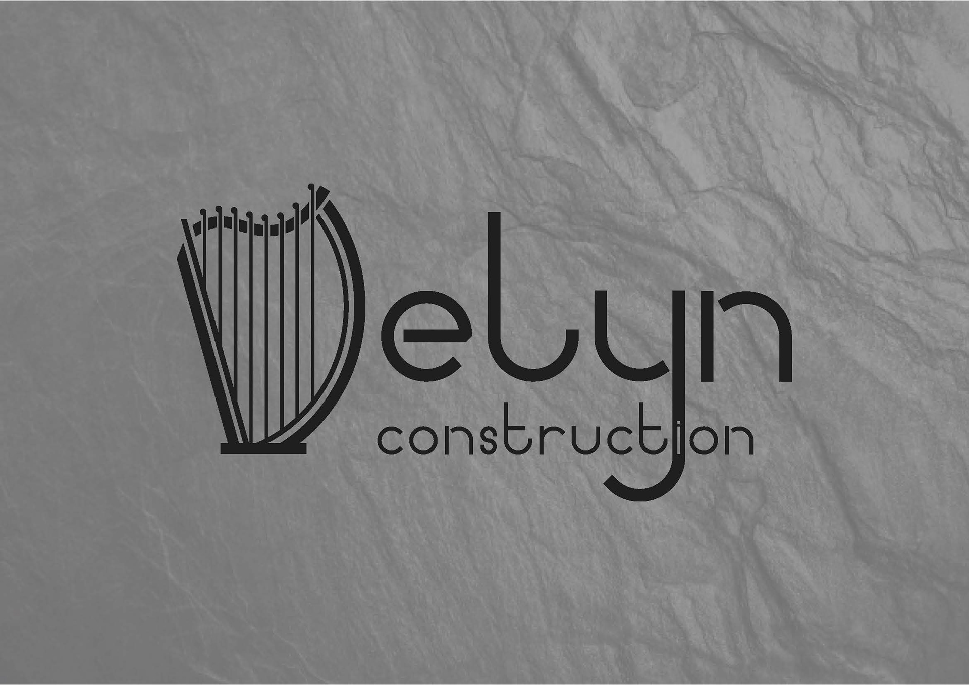
As slate is a staple material found in Wales I decided to use it as a texture behind my two favourite colour options.
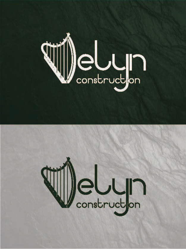
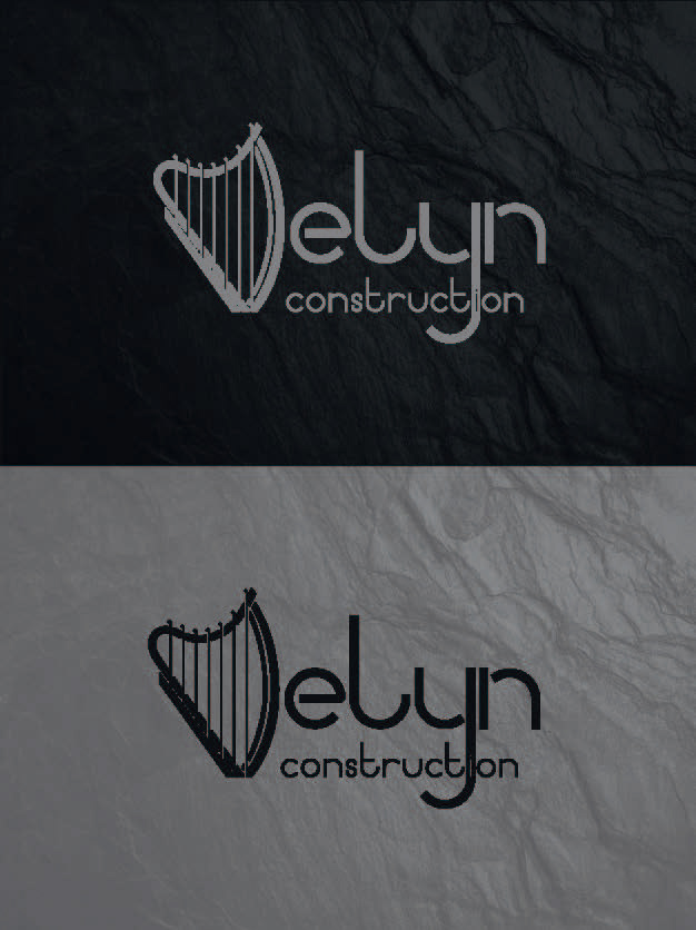
The effect made the brand feel more high-end and the client greatly liked it. However, he was concerned that the shape of the 'D' in the logo would be misunderstood as a 'V', and read as 'Velyn Construction'. To remedy this I re-designed the shape of the logo, giving it a more upright back and recognisable 'D' shape.
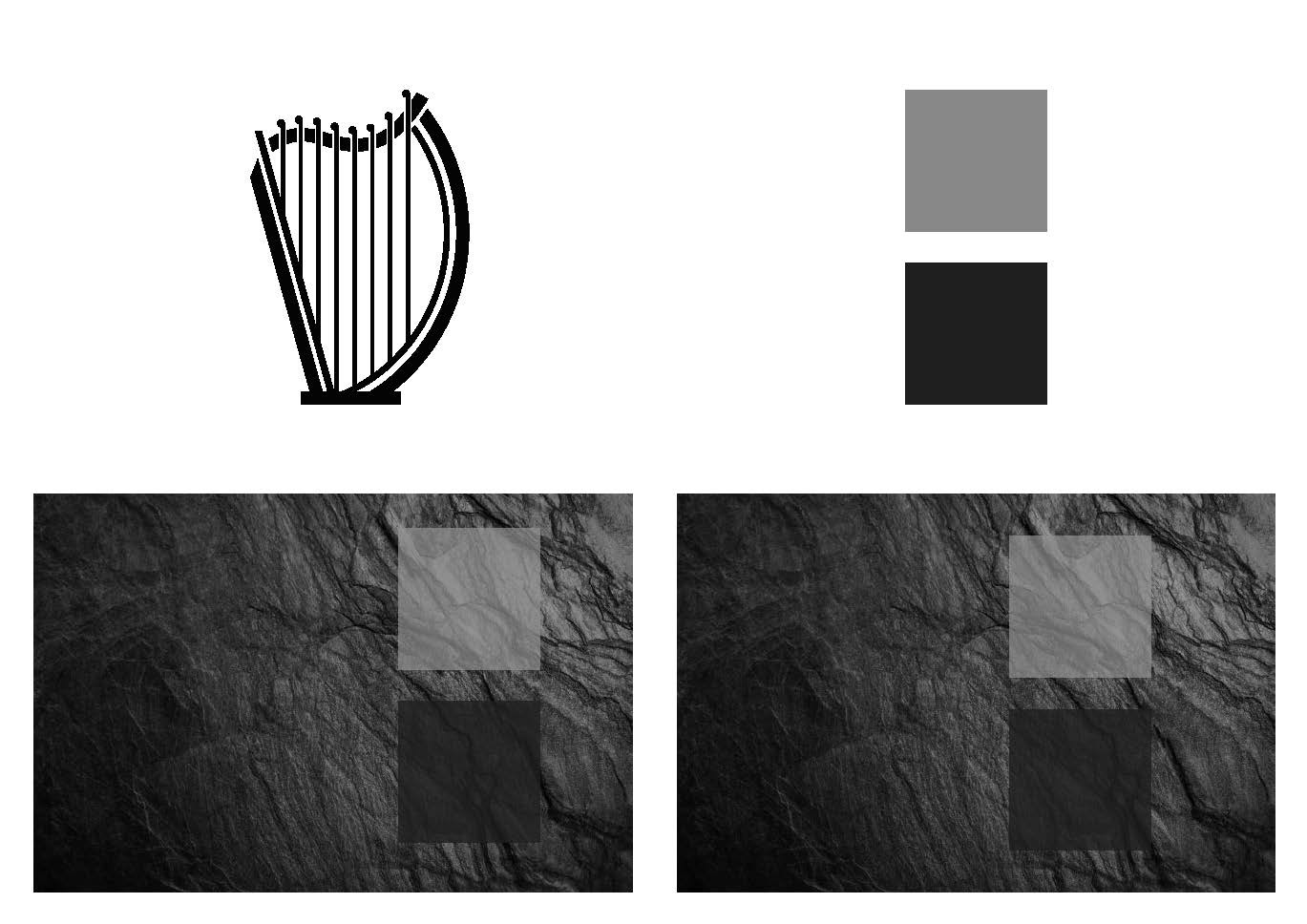
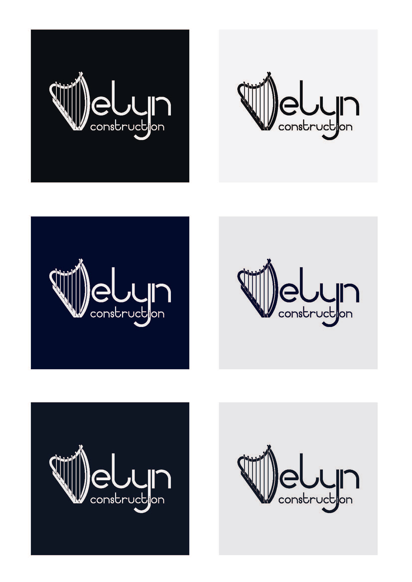
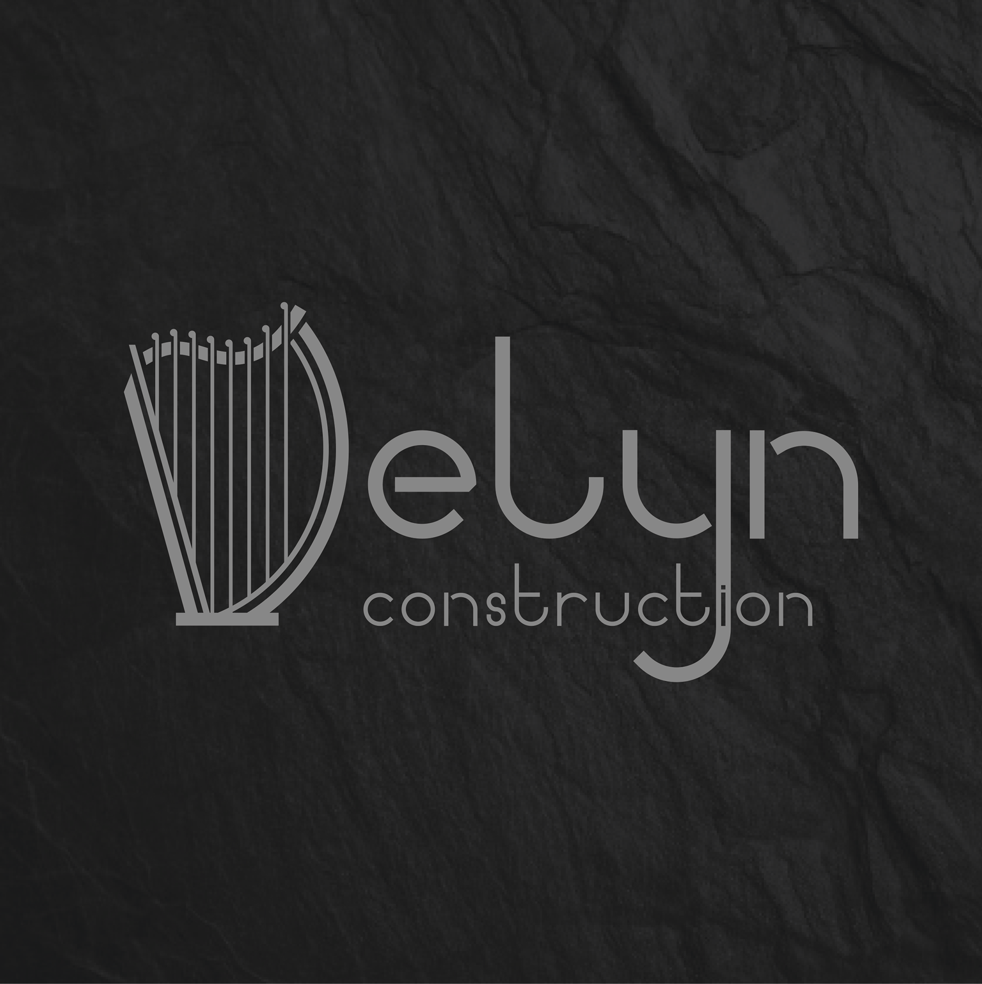
Final symbol shape texture and chosen colours

The final brand style used a light and dark colour mode. The default style was a dark background and light logo on top but also had the option of a light background and dark logo.


The 'D' shape itself also served as a branding symbol for smaller website and social media icons.