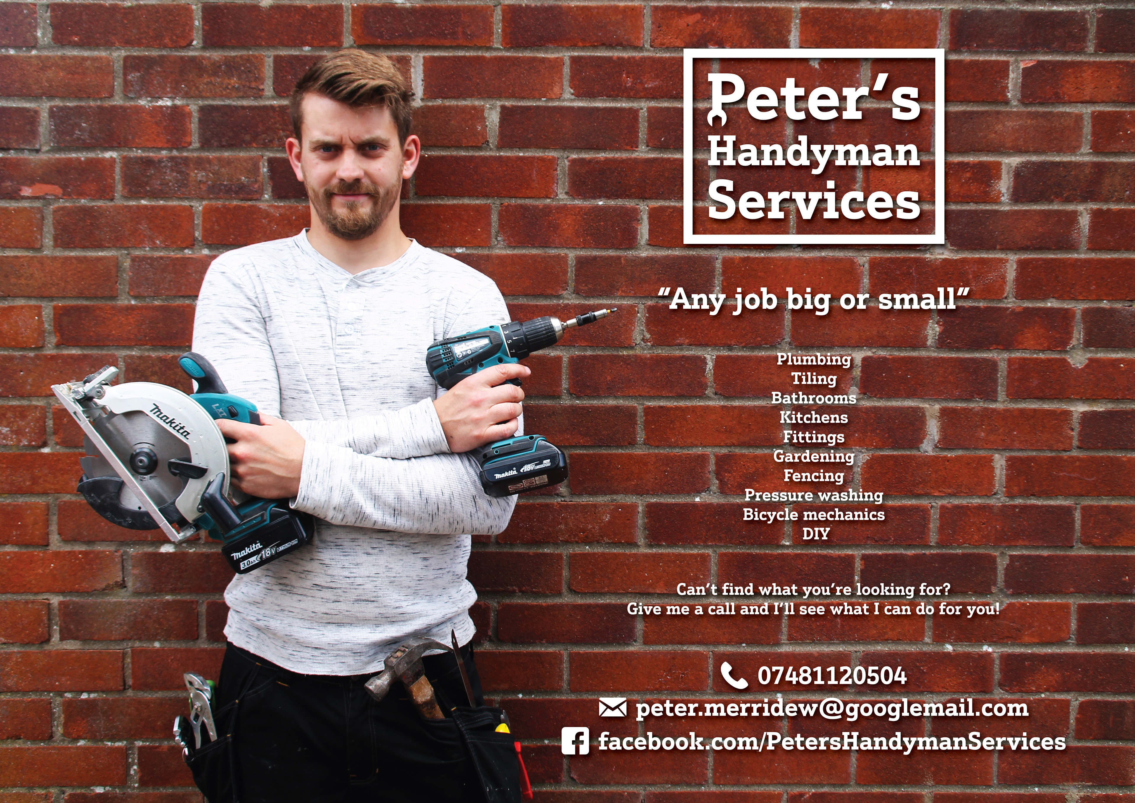
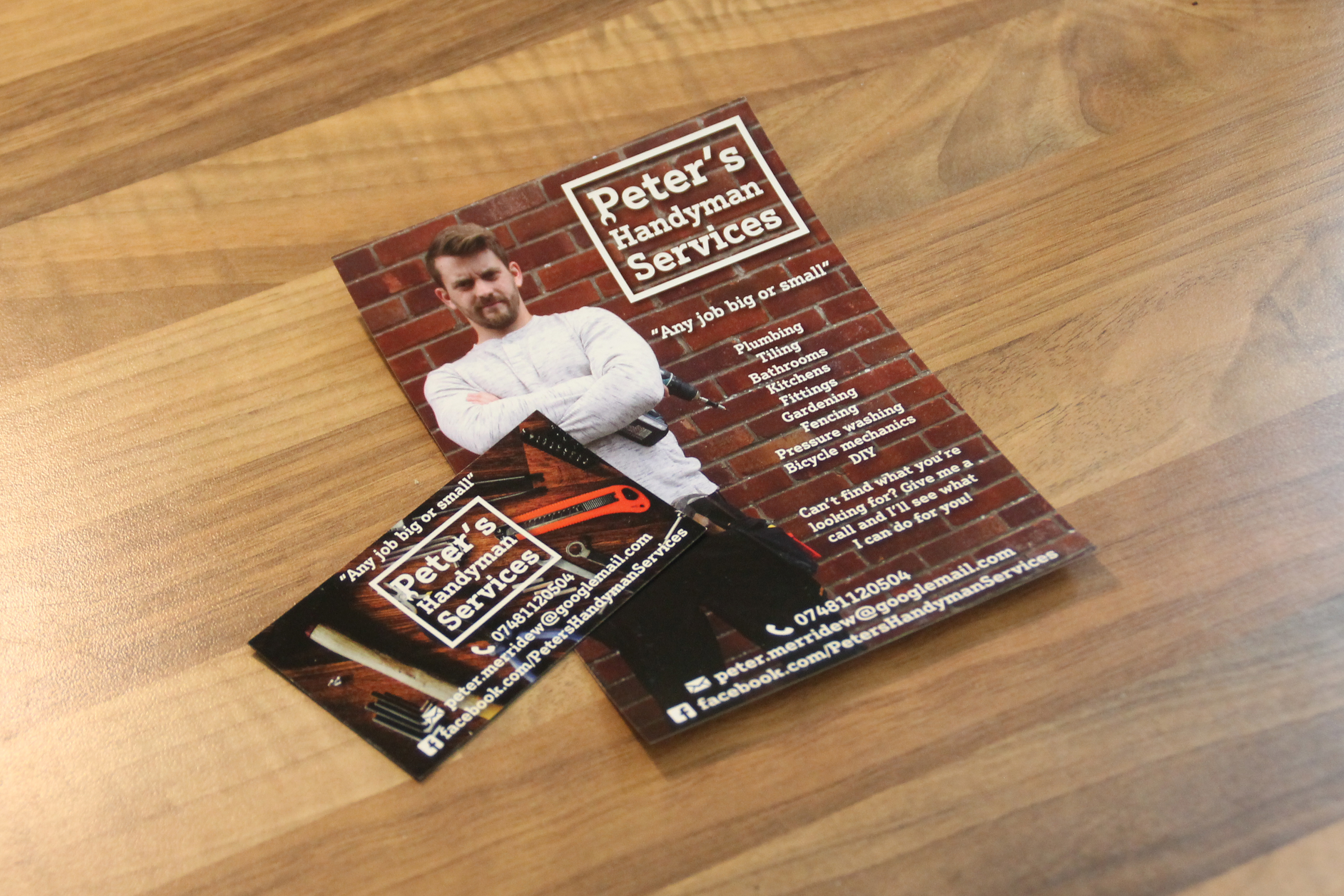
After deciding to start a new business my brother asked me to create a simple Brand to promote the business.
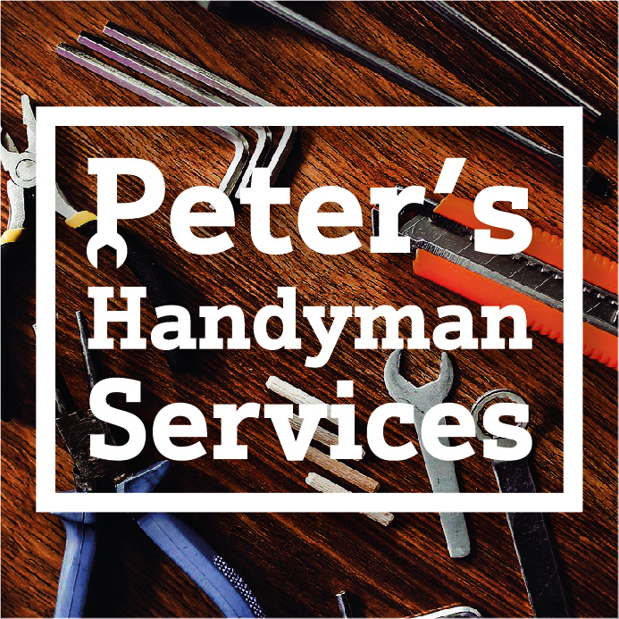
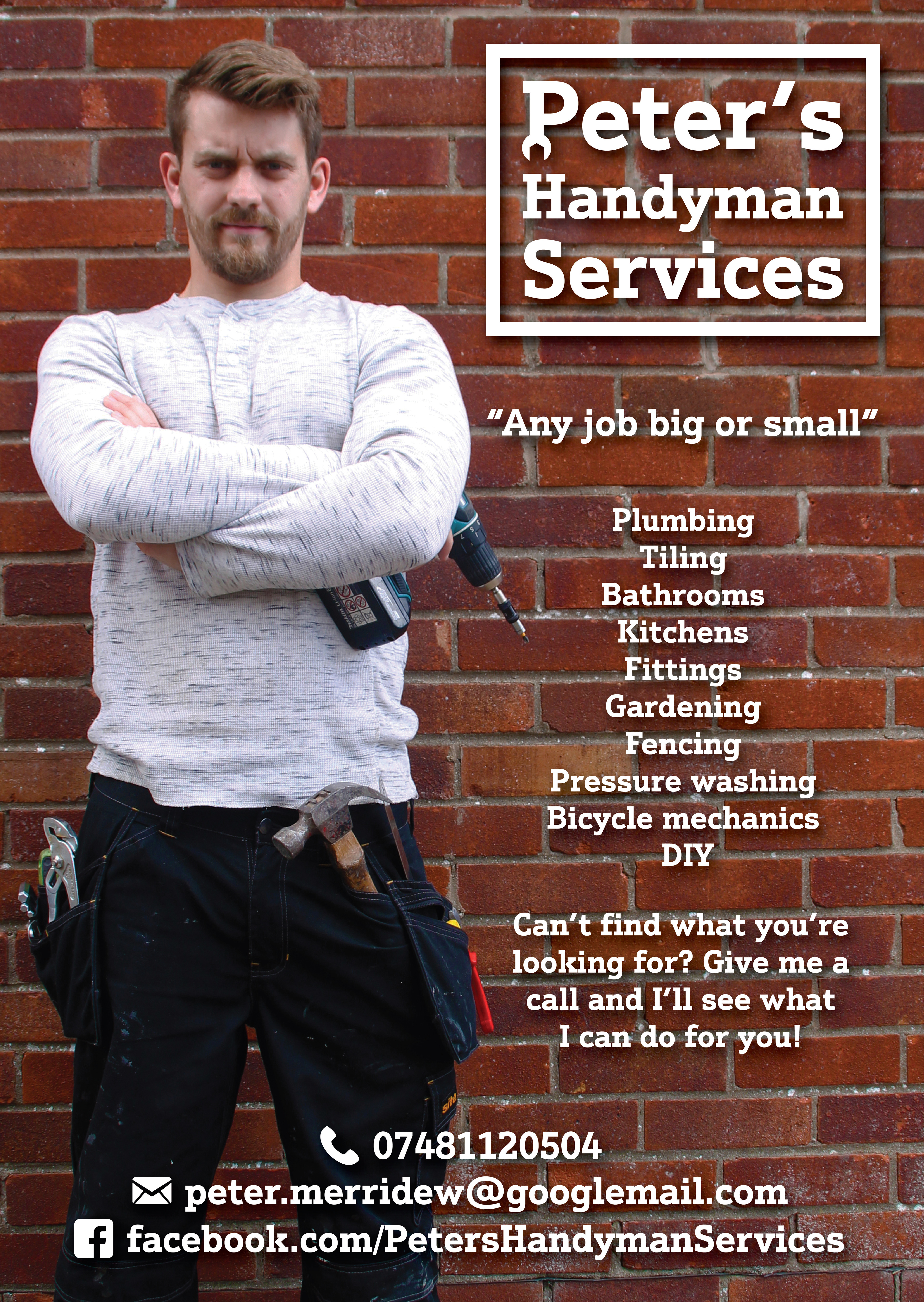
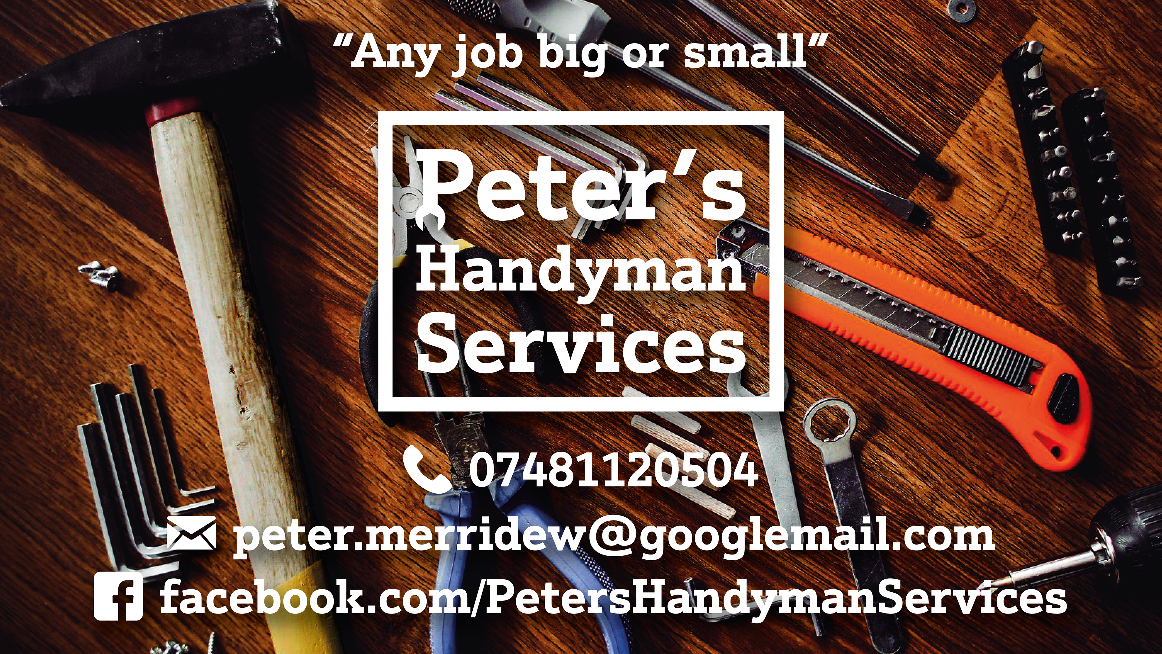
The design we settled on used a strong serif typeface to give the viewer an impression of a sturdy construction and bordered it with a thick line to make it stand out against accompanying text.
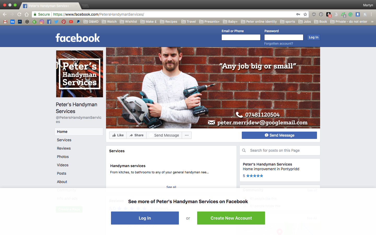
I took a range of photographs of peter and his tools to use a backdrops to his marketing material, giving the brand a recognisable and friendly face to associate with. As well as creating a logo, leaflets and facebook material, I advised peter to use magnetic business cards. This is in the hope that his customers would put them on the fridge instead of in a wallet, therefore keeping his brand visible and in the forefront of the customers mind.